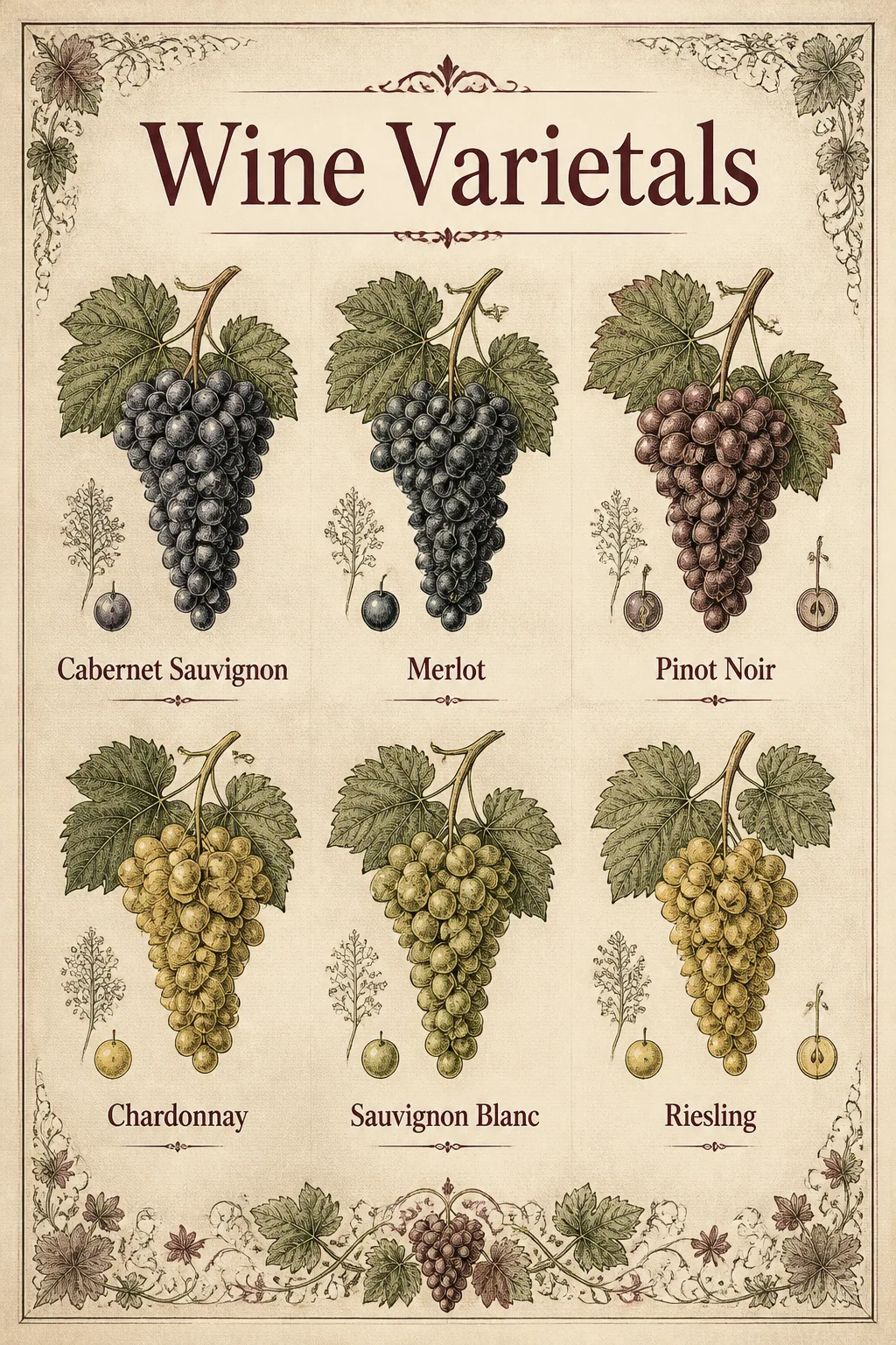
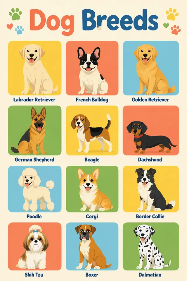
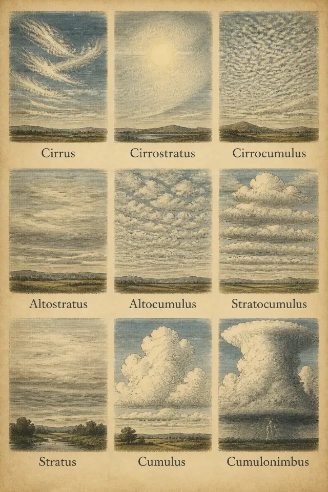
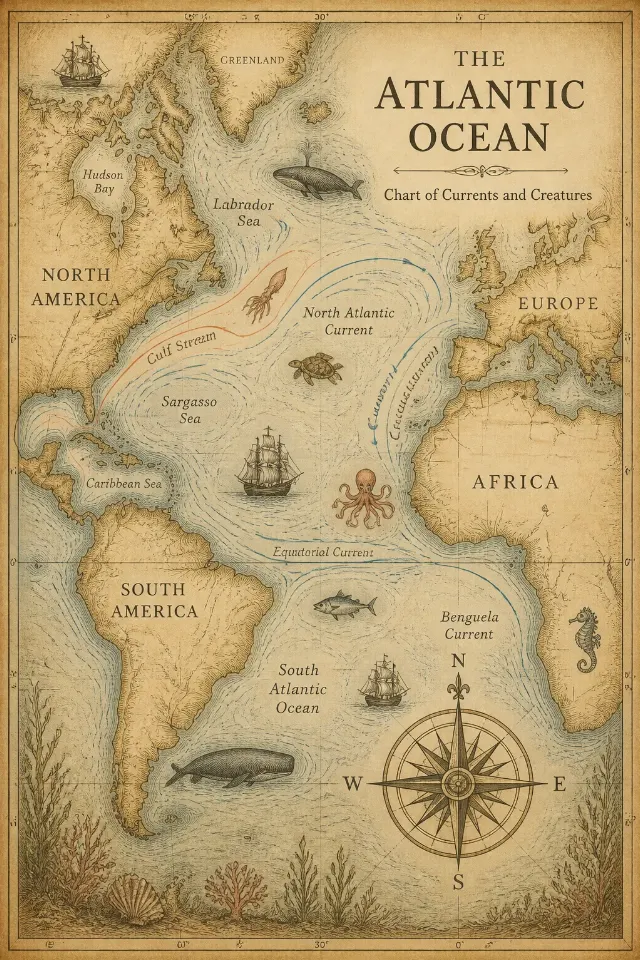
A front-facing wall art print featuring the Subject, arranged as a clear, balanced educational chart. Render the Text exactly as written, with the main heading prominent and each varietal label short, accurate and easy to read. Use the Art Style convincingly, with finely detailed grape clusters, vine leaves and restrained botanical ornament around the chart. Apply the Color Palette consistently across the illustrations, lettering and background. Design the print to complement the Room Style while keeping the artwork itself full-frame, with no frame, wall, furniture or room mockup visible. Use the Aspect Ratio and a carefully structured hierarchy with generous margins, crisp typography and evenly aligned labels. Add subtle realistic paper grain and a refined gallery-print finish. Keep every word spelled correctly, avoid decorative clutter, and do not add extra text, logos, signatures or watermarks.

Use these details:
Subject: "Wine varietals chart with illustrated grape clusters, leaves and small botanical details"
Art Style: "Vintage botanical engraving with fine ink lines and subtle paper texture"
Color Palette: "Burgundy, cream, muted sage and charcoal"
Text: ["Wine Varietals", "Cabernet Sauvignon", "Merlot", "Pinot Noir", "Chardonnay", "Sauvignon Blanc", "Riesling"]
Aspect Ratio: "Portrait 2:3"
Room Style: "Traditional dining room with warm wood and antique accents"
Using your own logo, product or face? Attach it in the chat and say which of the details it replaces.
Your result will come out close to the example rather than identical to it. Change the details to make it yours.