Design one single mobile app icon for the App Name or Type, based on the Icon Concept and rendered in the Style. Use the Color Palette with strong contrast between the symbol and the icon background. Present it as a real App Store or Google Play icon: an iOS-style rounded-square squircle centered on a plain very light neutral background, occupying about 70 percent of the square 1:1 canvas width, with a soft subtle shadow beneath it. Keep the icon simple and instantly readable at small sizes. Build the box and heart-shaped tape as one bold, centered symbol with comfortable padding, clean edges and gentle clay shading, soft highlights and believable rounded material. Use a solid background or restrained two-tone gradient inside the icon. No device, hands, mockup, extra objects, text outside the icon, detailed scene, thin lines, tiny details, sparkles, glow, lens flare, watermark or resemblance to an existing app icon, logo or mascot.

Use these details:
App Name or Type: "Moving App"
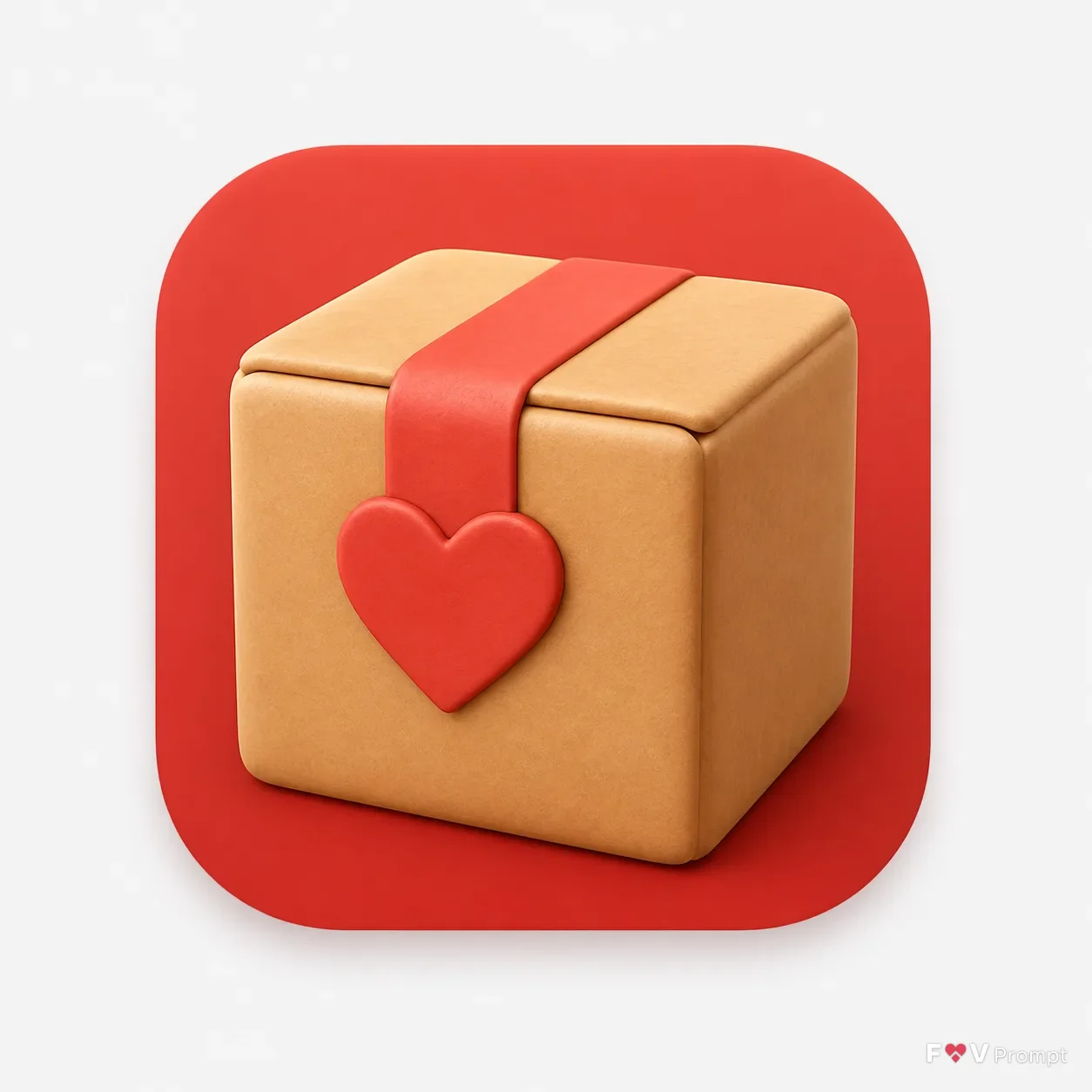
Icon Concept: "A cardboard moving box sealed with a heart-shaped strip of tape"
Style: "Soft clay 3D"
Color Palette: "kraft brown, warm red and cream"
Using your own logo, product or face? Attach it in the chat and say which of the details it replaces.
Your result will come out close to the example rather than identical to it. Change the details to make it yours.