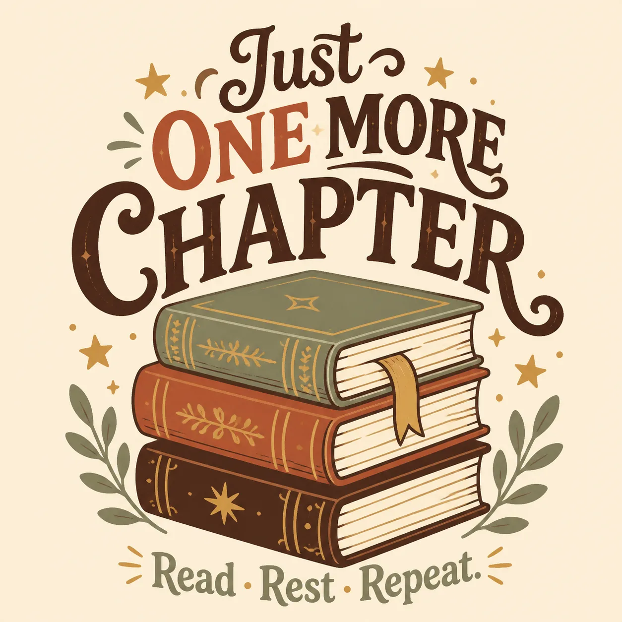
Build one centered, print-ready t-shirt graphic around the Slogan, with the optional Secondary Line set beneath it in smaller lettering. Integrate the Main Graphic Subject with the typography as one cozy book-lover composition: the stacked books should anchor the design, with the lettering wrapping around or sitting naturally above and below the illustration rather than floating separately. Use the Ink Colors in a limited screen-print-friendly palette with clean edges, strong silhouette, clear hierarchy and deliberate negative space. Set the artwork on a plain solid background matching the Shirt Color, with no shirt visible. Use a warm, handcrafted bookstore feel through sturdy vintage-inspired lettering, simple flat shapes and restrained decorative details. Keep every word correctly spelled and legible from a distance. The result must be a flat graphic suitable for screen printing or DTG, with no gradients, borders, watermarks, brand tags or price labels.

Use these details:
Slogan: "Just One More Chapter"
Secondary Line: "Read. Rest. Repeat."
Main Graphic Subject: "A stack of three cozy hardcover books with a bookmark and small star accents"
Ink Colors: ["Deep brown", "Muted rust", "Warm gold", "Soft sage"]
Shirt Color: "Warm cream"
Using your own logo, product or face? Attach it in the chat and say which of the details it replaces.
Your result will come out close to the example rather than identical to it. Change the details to make it yours.