Design one single mobile app icon for the App Type, using the Icon Concept as a clever, instantly readable central symbol. Apply the Style and Color Palette with strong contrast, a bold silhouette, comfortable padding and crisp edges. Present it as a real App Store or Google Play icon: an iOS-style rounded-square shape with smooth corners, centered on a plain very light neutral background, occupying about 70 percent of the square 1:1 canvas. Add a soft, subtle drop shadow beneath the icon. Keep the symbol simple and iconographic, with smart negative space rather than a detailed scene or illustration. No device, hands, mockup, text outside the icon, extra objects, thin hairlines, tiny details, sparkles, glow, lens flares, photographic texture, random lettering or watermarks. Make the result feel original and designed, not like clip art, and do not copy or resemble any existing app icon, brand logo or famous mascot.

Use these details:
App Type: "Surf forecast"
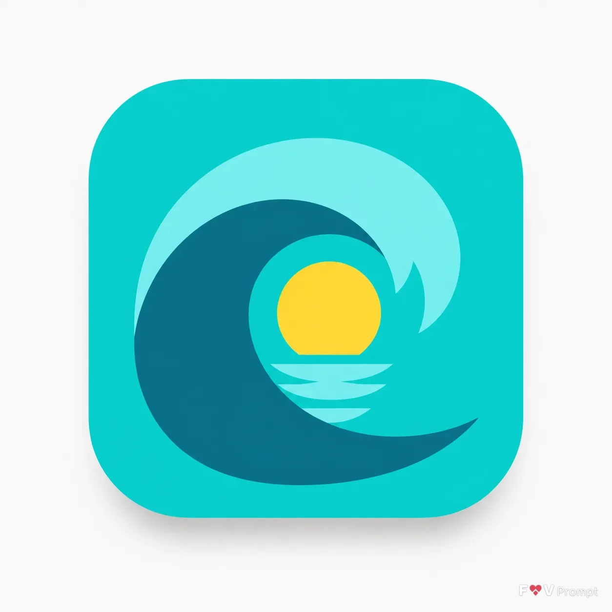
Icon Concept: "A curling wave with a tiny sun inside the barrel"
Style: "Flat icon with crisp geometric shapes"
Color Palette: "Turquoise and sunny yellow"
Using your own logo, product or face? Attach it in the chat and say which of the details it replaces.
Your result will come out close to the example rather than identical to it. Change the details to make it yours.