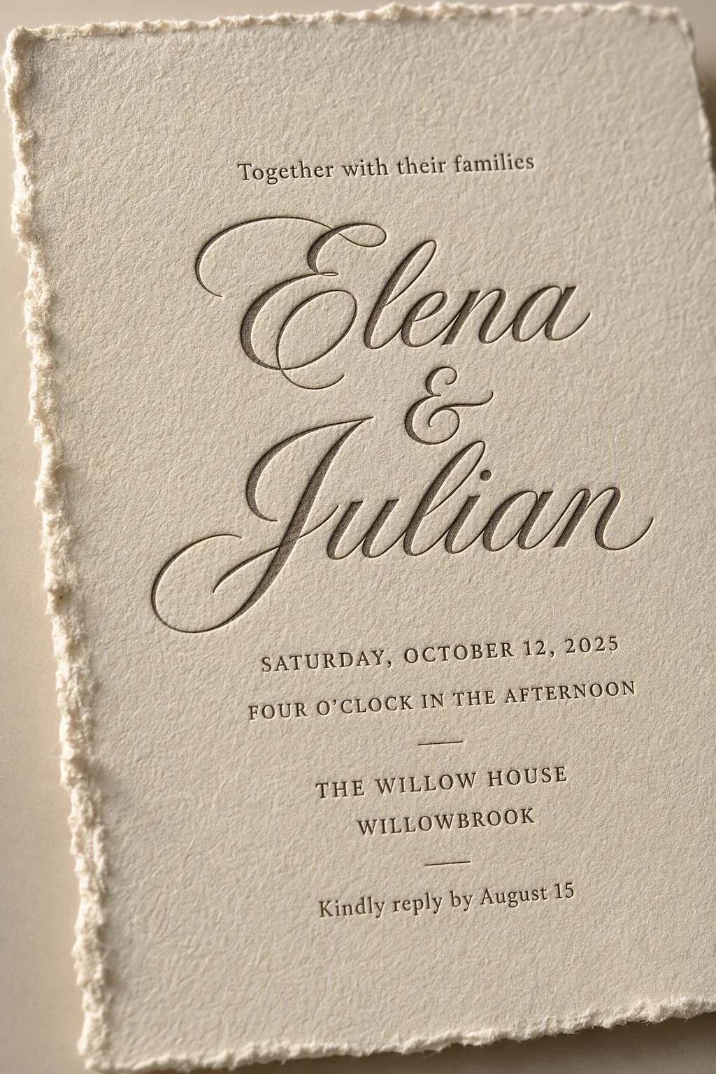
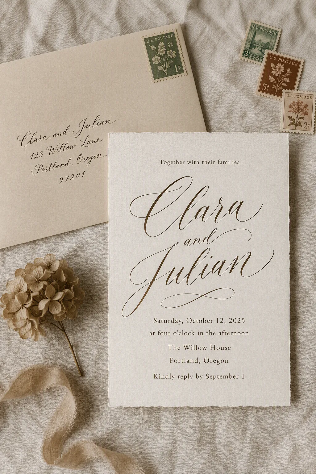
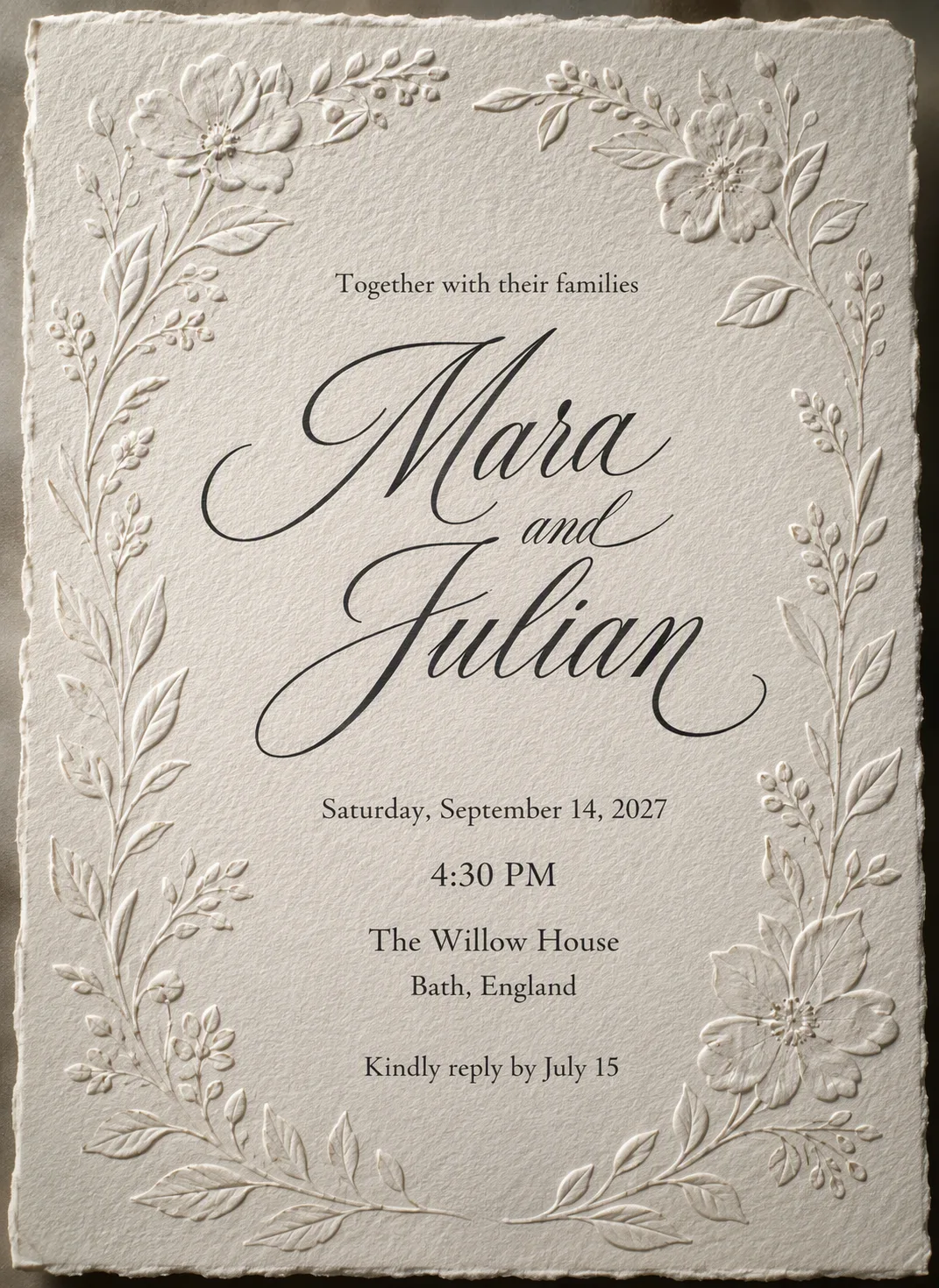
Show one wedding invitation as a tightly framed, realistic stationery photograph. Use the Paper Style for a thick handmade card with visible fibers, subtle tooth and an uneven raw edge. Compose a close crop that brings the deckled edge prominently into the foreground while keeping every line of the invitation text fully legible and comfortably inside the margins. Set the Opening Line above the Couple Names, making the Couple Names the largest and most decorative element in refined letterpress type. Place the Wedding Date, Wedding Time, Venue Name and City beneath in a smaller, clean serif or restrained small-caps sans-serif. Finish with the RSVP Line at the bottom. Use no more than two typefaces, centered alignment, generous breathing room and precise spelling. The letterpress should appear genuinely pressed into the paper, with delicate ink variation and shallow debossing. Illuminate the card with the Light Direction so the paper fibers, indentation and raw edge catch believable shadows. Keep the background quiet and neutral, with no props, watermarks, logos or border around the image.

Use these details:
Opening Line: "Together with their families"
Couple Names: "Elena & Julian"
Wedding Date: "Saturday, October 12, 2025"
Wedding Time: "Four o'clock in the afternoon"
Venue Name: "The Willow House"
City: "Willowbrook"
RSVP Line: "Kindly reply by August 15"
Paper Style: "warm ivory handmade cotton paper with a naturally irregular deckled edge"
Light Direction: "soft raking light from the left side"
Using your own logo, product or face? Attach it in the chat and say which of the details it replaces.
Your result will come out close to the example rather than identical to it. Change the details to make it yours.