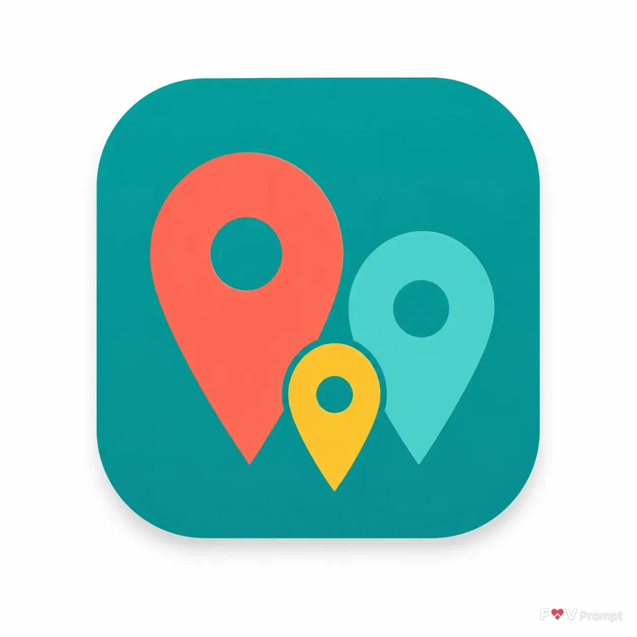
Turn the App Name Or Type into one clear, instantly readable app icon using the Icon Concept as the central symbol. Present a single iOS-style rounded-square icon with smooth squircle corners, centered on a plain very light neutral background and occupying about 70 percent of the square canvas. Use the Style and Color Palette inside the icon, with a solid or subtle two-tone background and strong contrast between the symbol and its backdrop. Arrange the three pins as a compact family-like group, with distinct sizes, bold silhouettes, comfortable padding, crisp edges and smart negative space. Keep the design simple, original and legible at small sizes. Add only a soft, subtle shadow beneath the icon. Show no device, hands, mockup, extra objects, text, letters, glow, sparkles, watermark or additional icons. Render as a polished App Store or Google Play icon shot in a 1:1 format.

Use these details:
App Name Or Type: "Family location app"
Icon Concept: "Three location pins of different sizes standing together like a family"
Style: "Flat illustration"
Color Palette: "coral, teal and yellow"
Using your own logo, product or face? Attach it in the chat and say which of the details it replaces.
Your result will come out close to the example rather than identical to it. Change the details to make it yours.