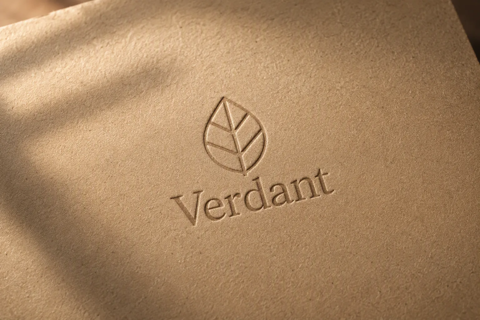
A tactile branding mockup showing the Logo Mark deeply debossed into a single sheet of Paper Tone. Frame the paper from a slight overhead three-quarter angle, with the logo centered and generous negative space around it. Use soft directional window light from the upper left, creating gentle shadows inside the recessed mark and subtle texture across the uncoated paper fibers. Keep the composition restrained and editorial, with crisp detail in the embossing and naturally uneven kraft-paper grain. Use a warm, earthy palette and a shallow depth of field that keeps the logo and its immediate surface sharp while the far edges soften. Photorealistic studio product photography, clean background, understated luxury, no extra objects, no printed ink, and no warped or misspelled lettering.

Use these details:
Logo Mark: "a simple geometric leaf emblem with the wordmark 'Verdant'"
Paper Tone: "warm natural kraft brown"
Using your own logo, product or face? Attach it in the chat and say which of the details it replaces.
Your result will come out close to the example rather than identical to it. Change the details to make it yours.