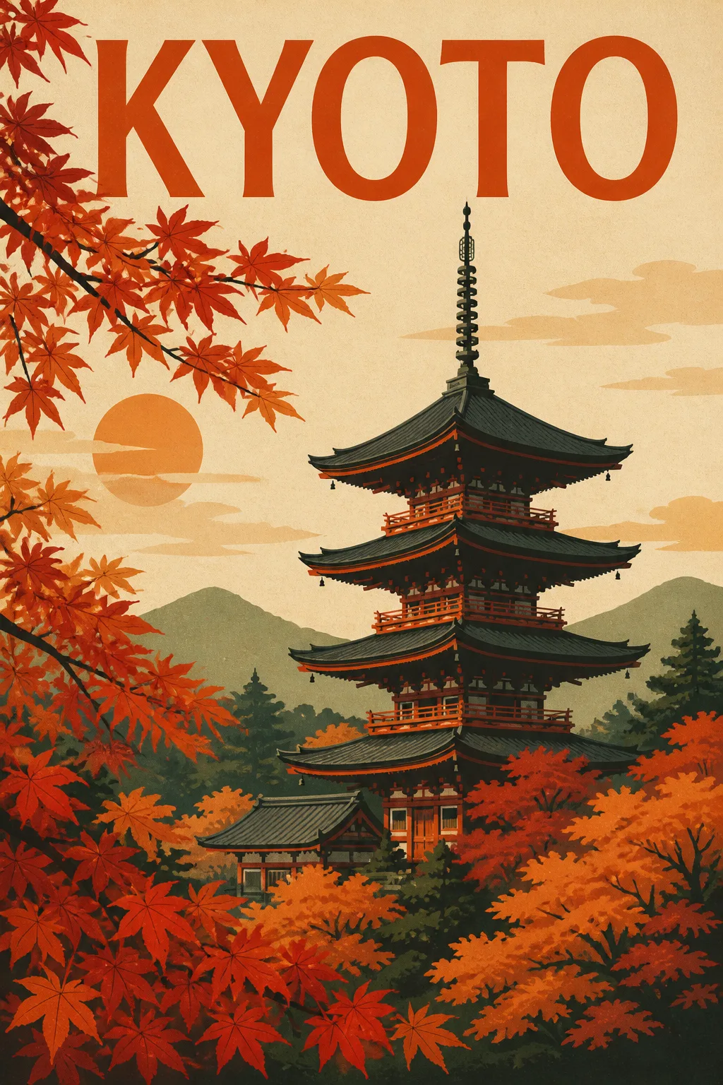
Build a finished travel poster around the Subject, shown flat and front-facing and filling the entire canvas. Render it in the Art Style with crisp, simplified shapes, limited ink layers, clean silhouettes and subtle real paper texture. Arrange the pagoda as the clear focal point, with autumn maple branches framing the composition and a balanced sense of depth created through overlapping graphic forms. Use the Color Palette consistently across the architecture, foliage, sky and negative space. Render the Text exactly as written, using concise vintage travel-poster typography that is integrated into the composition without obscuring the artwork. Make the design feel suitable for the Room Style while keeping the room completely out of view. Use the Aspect Ratio. Print-ready, gallery-quality finish with sharp edges, convincing screen-print registration and no frame, border, watermark, logo or extra text.

Use these details:
Subject: "Kyoto pagoda surrounded by autumn maple trees"
Art Style: "Flat screen-print illustration with layered ink shapes and subtle paper texture"
Color Palette: "Burnt orange, deep vermilion, muted cream, charcoal and forest green"
Text: "KYOTO"
Aspect Ratio: "Portrait 2:3"
Room Style: "Warm minimalist living room with natural wood and neutral furnishings"
Using your own logo, product or face? Attach it in the chat and say which of the details it replaces.
Your result will come out close to the example rather than identical to it. Change the details to make it yours.