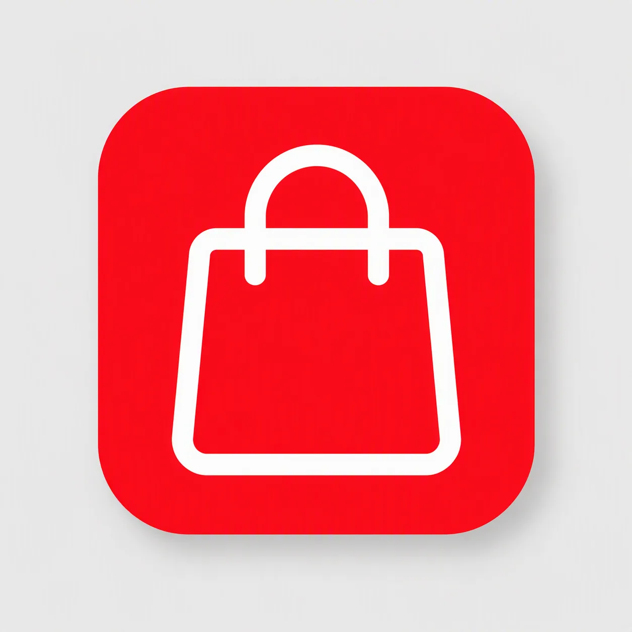
Design one mobile app icon built around the Central Symbol. Use the Primary Color as a full-bleed background inside a standard iOS and Android rounded square, with the Central Symbol rendered in the Secondary Color as a bold, even outline. Keep the symbol centered and large, filling roughly 60 to 70 percent of the icon with generous, balanced padding. Use simple confident shapes that remain instantly readable at 48 pixels. Keep the artwork flat with clean edges, no thin hairlines, tiny details, border, inner frame, gloss or extra text. Show the icon alone, centered on the Presentation Background with a soft natural shadow. Use only the specified colors plus white where needed, and do not include brand logos, trademarked characters or watermarks.

Use these details:
Central Symbol: "simple shopping bag outline"
Primary Color: "bold red"
Secondary Color: "white"
Presentation Background: "soft light gray"
Using your own logo, product or face? Attach it in the chat and say which of the details it replaces.
Your result will come out close to the example rather than identical to it. Change the details to make it yours.