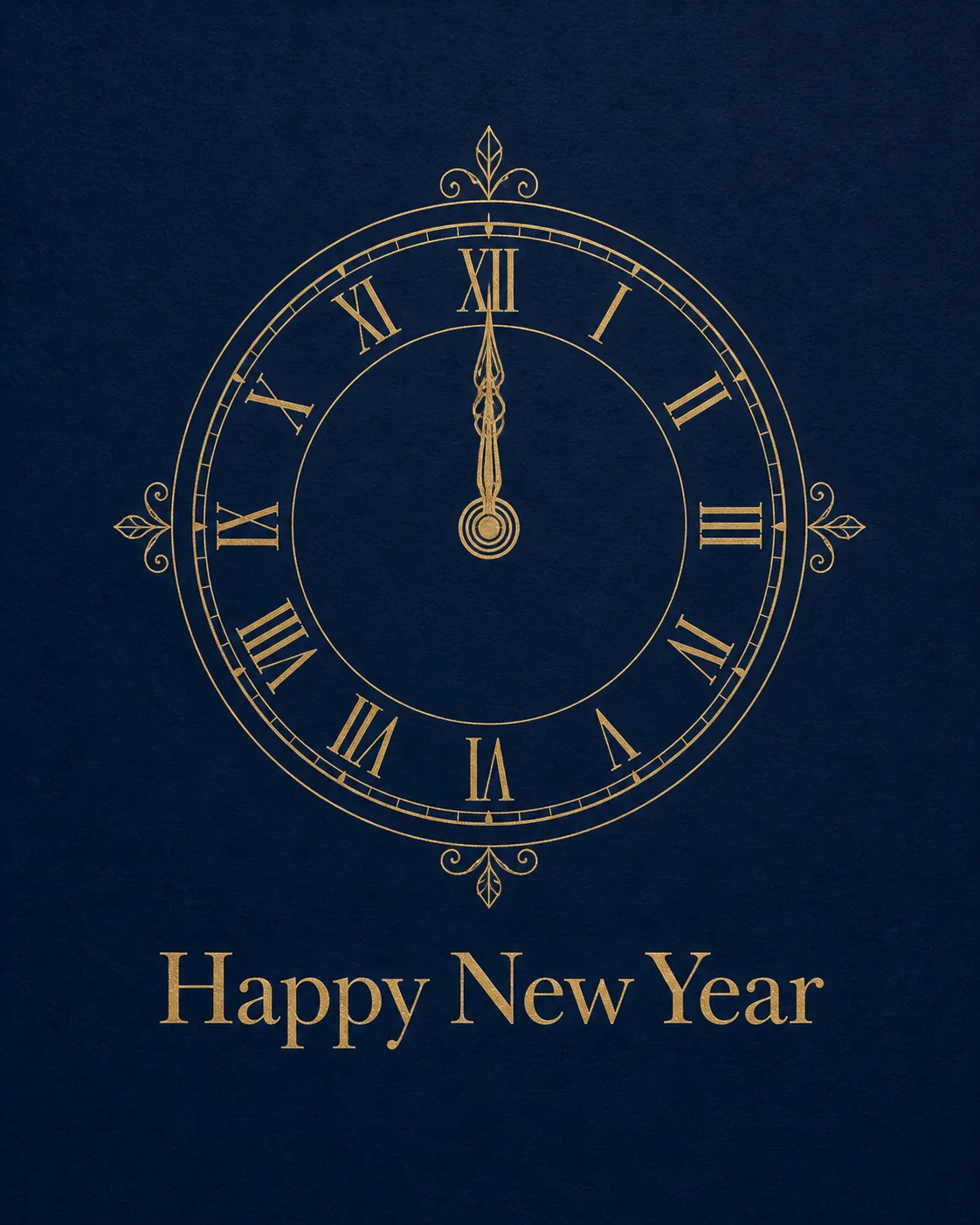
Show the front of the card flat and straight-on, filling the frame in the Format. Build the design around the Main Illustration, rendered as a precise thin-line drawing with balanced proportions and generous navy negative space. Use the Color Palette with restrained contrast: deep navy as the card ground and metallic gold for the clock lines and Greeting Text. Set the Greeting Text clearly beneath or above the clock in an elegant, highly legible serif typeface, with careful spacing and no extra wording. Keep the composition centered, calm and uncluttered, with generous margins and nothing touching the edges. Make the linework and subtle paper grain feel physically printed on quality card stock, with a refined metallic-ink effect rather than a glossy digital glow. Ensure every word is spelled correctly and fully legible. Do not add random sparkles, glowing orbs, lens flares, watermarks or signatures.

Use these details:
Occasion: "New Year's Eve"
Greeting Text: "Happy New Year"
Art Style: "Minimalist thin-line illustration"
Main Illustration: "A classic clock face with its hands pointing to midnight"
Color Palette: "Deep navy and metallic gold"
Format: "4:5 portrait, 5x7 card"
Using your own logo, product or face? Attach it in the chat and say which of the details it replaces.
Your result will come out close to the example rather than identical to it. Change the details to make it yours.