Design a single, instantly readable mobile app icon for the App Type. Use the Icon Concept as one bold, centered symbol with a strong silhouette, comfortable padding, crisp edges and smart negative space. Render it in the Style, using the Color Palette with strong contrast between the symbol and its rounded-square background. Present the icon as a real iOS App Store or Google Play icon: an iOS-style squircle with smooth rounded corners, centered on a plain very light neutral background, occupying about 70 percent of the square canvas width, with a soft subtle shadow beneath it. Keep the canvas square at 1:1. Use only simple flat shapes and no detailed scene, extra objects, thin lines, tiny details, text, letters, sparkles, glow, lens flare, device, hands or mockup. The result should feel original and designed, remain legible at small sizes, and not resemble any existing app icon, logo or mascot. No watermarks.

Use these details:
App Type: "Tennis booking app"
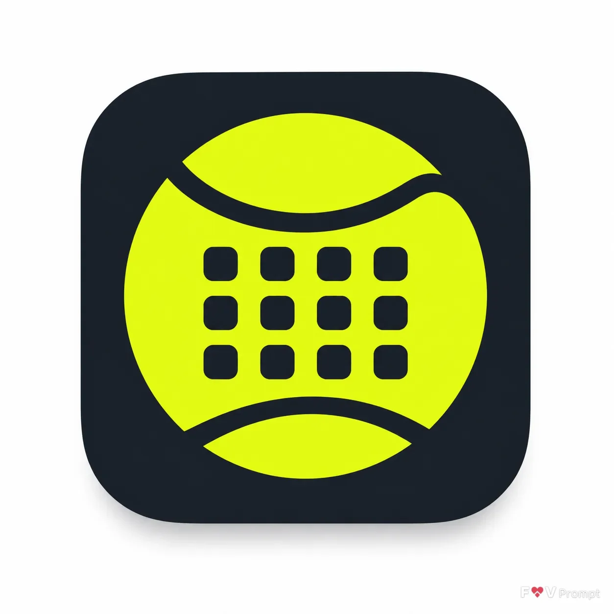
Icon Concept: "A tennis ball whose curved seam forms a simple calendar grid"
Style: "Flat illustration"
Color Palette: "Neon yellow-green with deep charcoal"
Using your own logo, product or face? Attach it in the chat and say which of the details it replaces.
Your result will come out close to the example rather than identical to it. Change the details to make it yours.