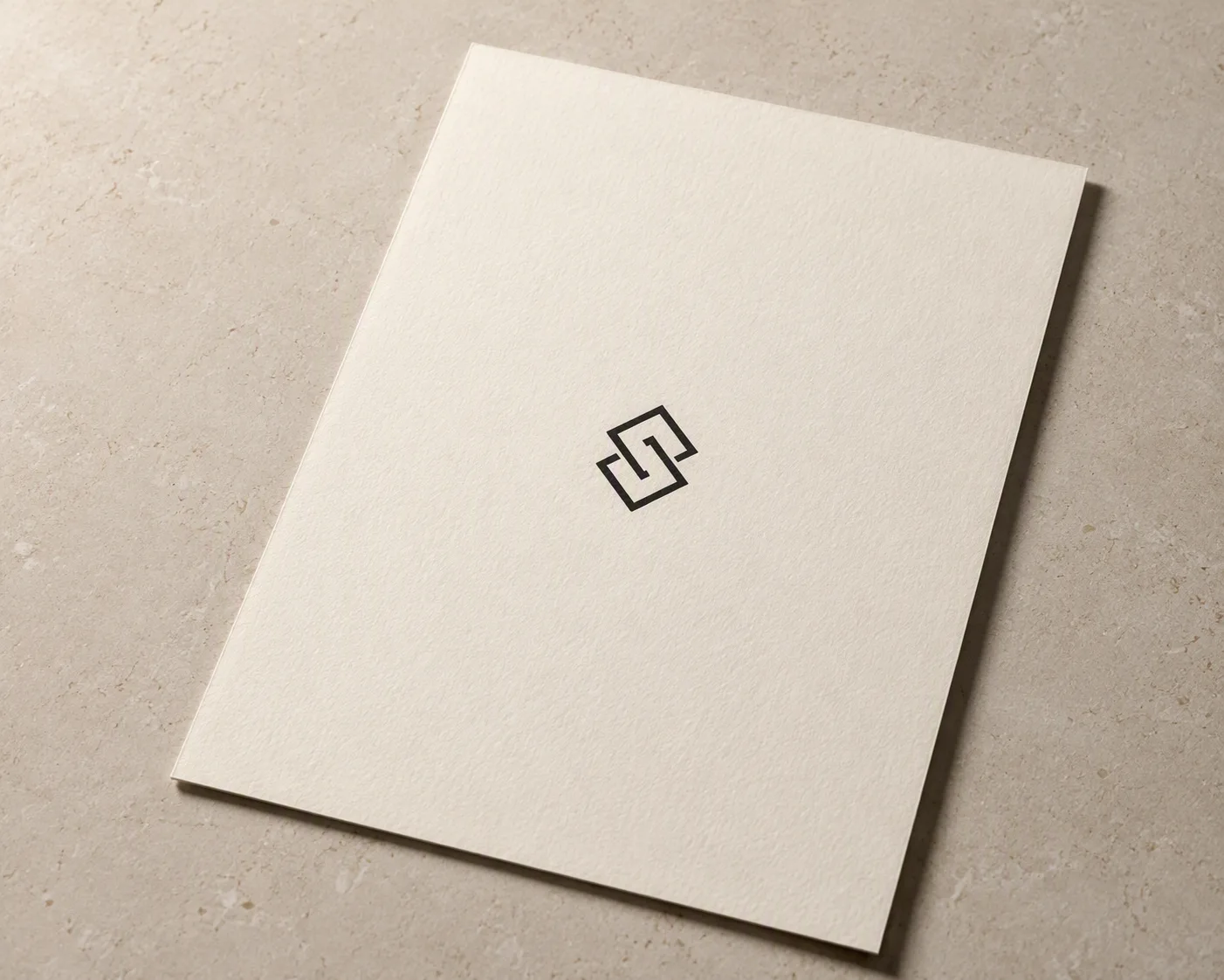
Present the Logo Mark printed cleanly at the center of a premium letterhead sheet made from the Paper Stock, using the Paper Color as the dominant tone. Arrange the stationery on the Surface in a restrained three-quarter overhead composition, with generous negative space and crisp, carefully aligned edges. Use soft studio lighting from the upper left to create a gentle shadow beneath the paper and a delicate relief along its edges, without harsh reflections or distracting props. Keep the logo sharp, correctly proportioned and naturally integrated into the paper fibers. The image should feel like a refined branding presentation, photographed with a 50mm lens, subtle depth of field, neutral tonal balance and realistic paper texture.

Use these details:
Logo Mark: "a simple black geometric monogram formed from two interlocking lines"
Paper Stock: "thick uncoated cotton paper with a subtle tactile grain"
Paper Color: "warm ivory"
Surface: "light beige stone tabletop"
Using your own logo, product or face? Attach it in the chat and say which of the details it replaces.
Your result will come out close to the example rather than identical to it. Change the details to make it yours.