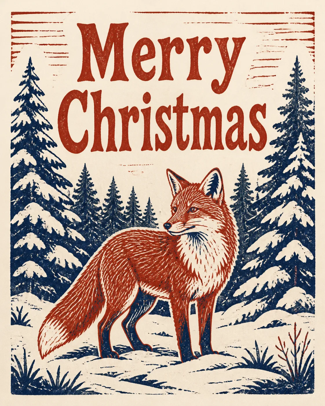
Design the front of a Christmas card in the Format, shown completely flat and front-facing so it fills the frame. Build the composition around the Main Illustration, using the Art Style with carved edges, visible ink grain, slight registration variation and tactile texture on quality uncoated card stock. Use the Color Palette in a restrained two-color print treatment, with strong navy shapes for the forest and fox details against warm red areas and the paper ground. Place the Greeting Text prominently in a hand-carved display typeface, keeping every word crisp, correctly spelled and fully legible. Keep the greeting as the only text, with generous margins and a clear hierarchy. Balance the fox against layered snowy trees and simple snow shapes without crowding the edges. The result should feel like an authentic handmade linocut Christmas card, not a glossy digital illustration. No random sparkles, glowing effects, lens flares, 3D plastic, logos, signatures or watermark.

Use these details:
Occasion: "Christmas"
Greeting Text: "Merry Christmas"
Art Style: "Traditional two-color linocut print"
Main Illustration: "A fox standing in a snowy evergreen forest"
Color Palette: "Brick red and deep navy"
Format: "4:5 portrait"
Using your own logo, product or face? Attach it in the chat and say which of the details it replaces.
Your result will come out close to the example rather than identical to it. Change the details to make it yours.