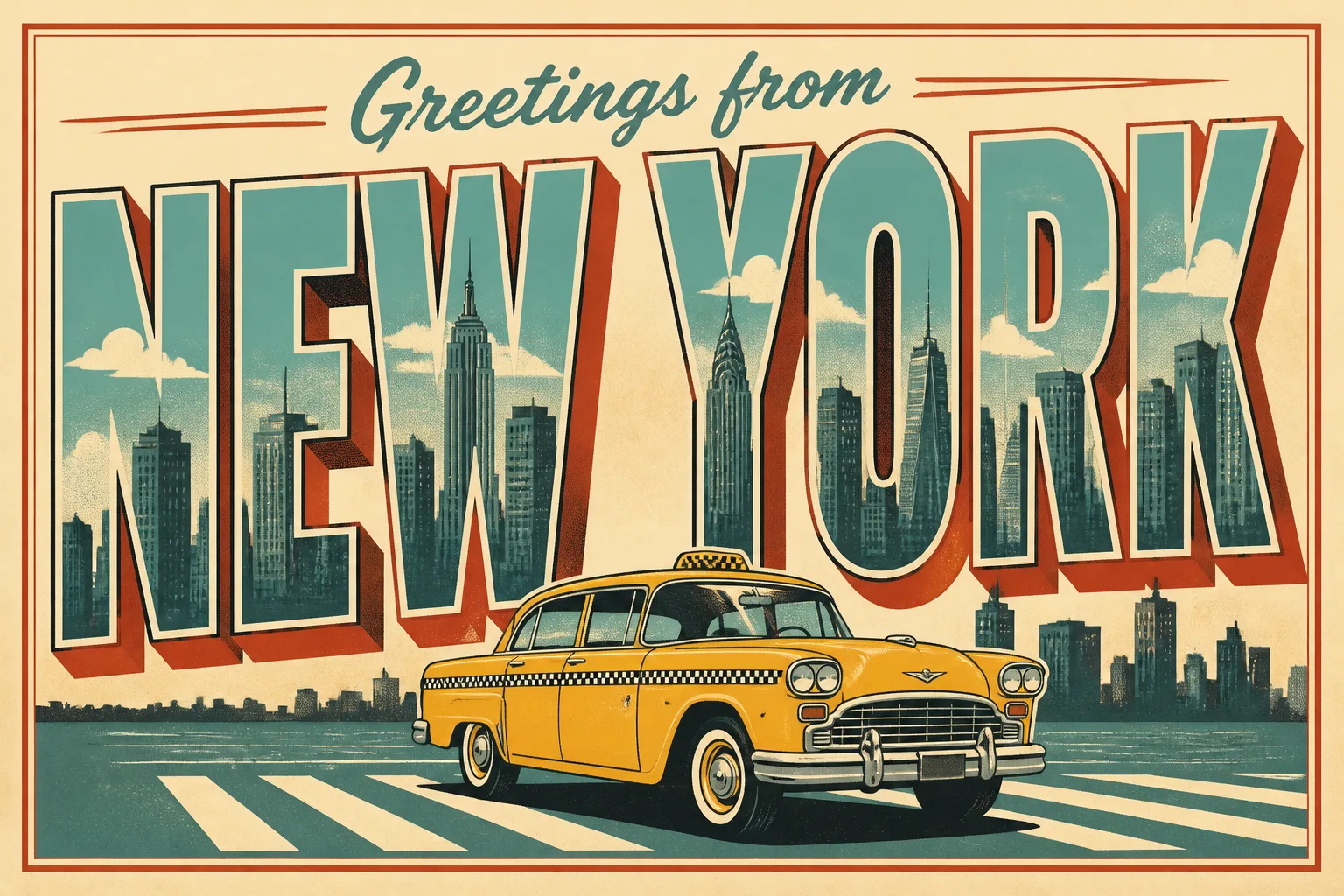
A flat, front-facing postcard celebrating the Occasion, filling the frame in the Format. Render the Greeting Text exactly as written, with the words "NEW YORK" enlarged into the dominant display lettering and "Greetings from" set smaller above or below it. Place the Main Illustration inside and around the large letters, integrating the taxi and skyline into the typography without making the text difficult to read. Use the Art Style with crisp screen-printed edges, subtle ink variation and tactile paper texture, as if printed on quality card stock. Apply the Color Palette consistently, with clear contrast between the lettering and illustration. Keep generous margins, a strong visual hierarchy and one unified composition. Include no other words, addresses, stamps, logos, watermarks or signatures.

Use these details:
Occasion: "New York travel postcard"
Greeting Text: "Greetings from New York"
Art Style: "1950s-inspired retro screen print"
Main Illustration: "a classic yellow taxi crossing in front of a simplified Manhattan skyline"
Color Palette: "taxi yellow, warm cream, brick red, teal and charcoal"
Format: "3:2 landscape postcard"
Using your own logo, product or face? Attach it in the chat and say which of the details it replaces.
Your result will come out close to the example rather than identical to it. Change the details to make it yours.