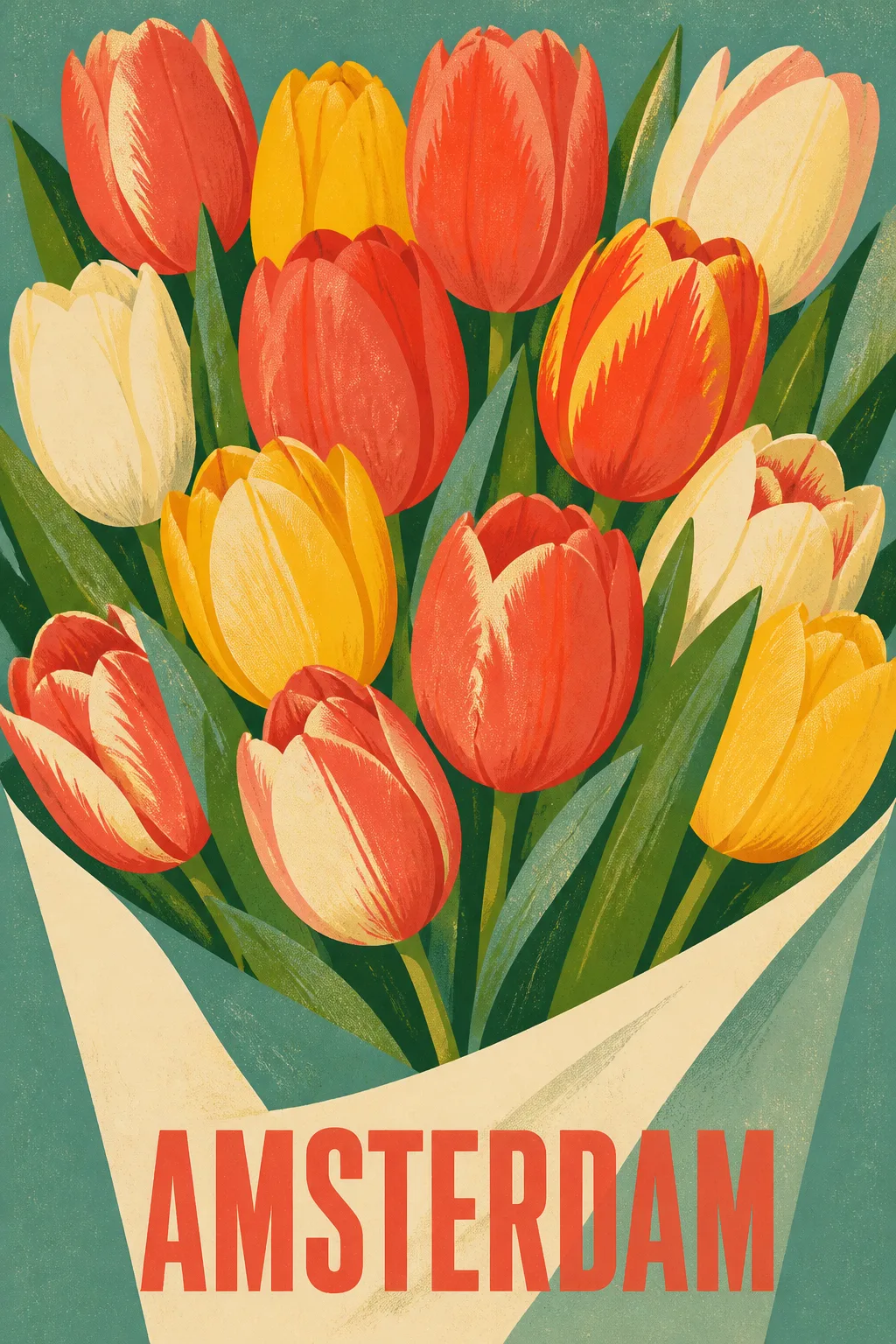
Design a finished wall art print featuring the Subject in the Art Style. Fill the entire canvas edge to edge with a flat, front-facing composition and no frame or surrounding room. Arrange the tulips as a generous, graphic bouquet with simplified botanical shapes, strong silhouettes and confident blocks of color. Use the Color Palette with screen-printed ink variation, subtle paper grain and a lightly imperfect registration that feels handmade rather than digitally glossy. Add the Text as a small city name, set in bold retro display typography with clean, legible lettering and balanced spacing. Make the type feel integrated into the poster composition without competing with the flowers. Let the visual balance and warmth suit the Room Style. Use the Aspect Ratio, with accurate spelling, no extra words, logos, signatures or watermarks, and a gallery-quality print finish.

Use these details:
Subject: "A full bunch of vivid tulips arranged like a flower market bouquet"
Art Style: "Mid-century screen print with bold retro poster design"
Color Palette: "Coral red, butter yellow, leafy green, cream and muted teal"
Text: "AMSTERDAM"
Aspect Ratio: "2:3 portrait"
Room Style: "Warm mid-century modern living room"
Using your own logo, product or face? Attach it in the chat and say which of the details it replaces.
Your result will come out close to the example rather than identical to it. Change the details to make it yours.