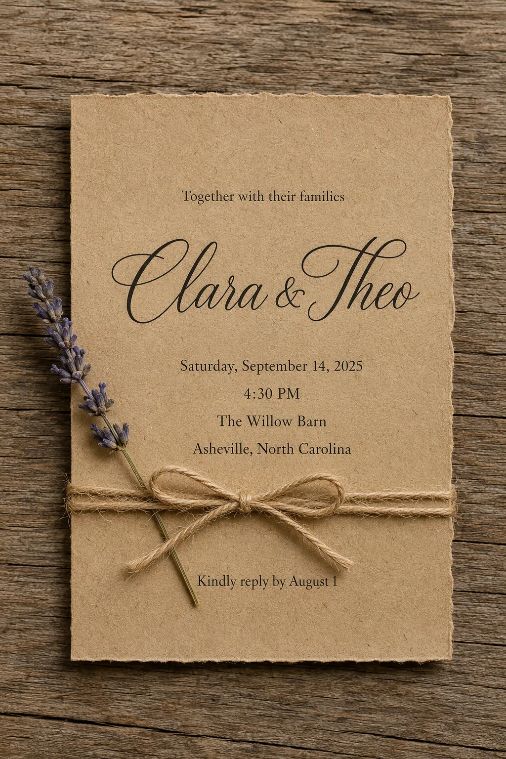
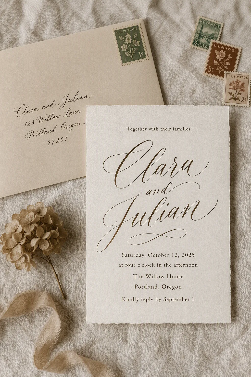
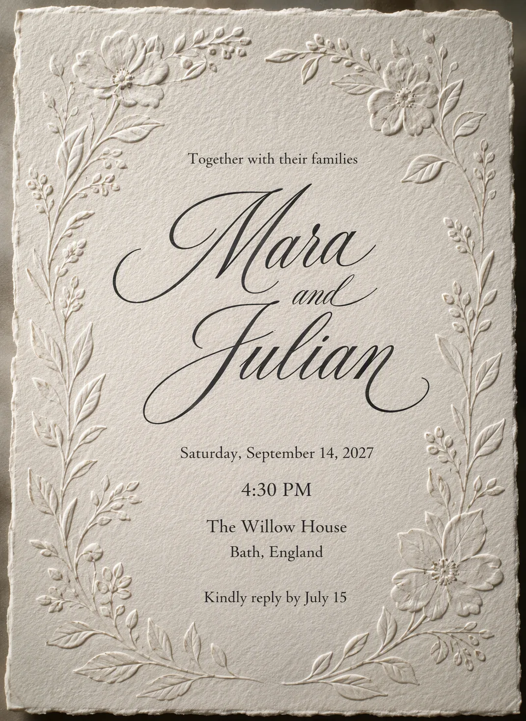
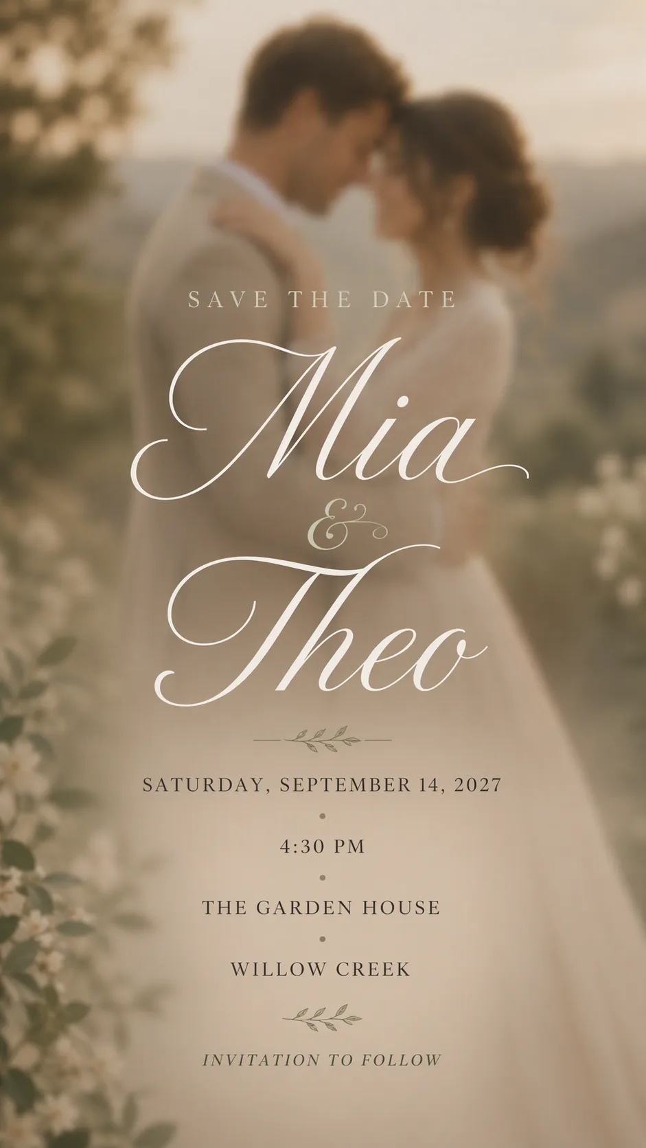
Arrange a single wedding invitation flat and top-down on the Surface, with the card made from the Paper Material and tied neatly with the Tie Detail. Tuck the Floral Accent beneath the twine so it rests beside the card without covering any text. Show realistic paper thickness, softly uneven edges, visible kraft fibers, and subtle natural shadows against the wood grain.

Set the Short Opening Line above the Couple First Names. Make the Couple First Names the largest and most decorative element in an elegant, legible script. Place the Wedding Date, Wedding Time, Venue Name, and City beneath it in one smaller refined serif typeface with generous spacing. Add the RSVP Line at the bottom in the same supporting typeface. Render every field exactly as written, with correct spelling, deliberate centered alignment, and generous margins. Use no more than two typefaces. Keep the lavender and twine as restrained rustic accents that frame rather than crowd the typography. Photograph the stationery with soft natural light, gentle shadows, warm neutral color, and a realistic professional invitation mockup finish. Include no watermark, logo, or border around the image.

Use these details:
Couple First Names: "Clara & Theo"
Wedding Date: "Saturday, September 14, 2025"
Wedding Time: "4:30 PM"
Venue Name: "The Willow Barn"
City: "Asheville, North Carolina"
Short Opening Line: "Together with their families"
RSVP Line: "Kindly reply by August 1"
Paper Material: "Warm brown kraft paper with visible fibers"
Tie Detail: "Natural jute twine tied in a small bow"
Floral Accent: "One delicate sprig of dried lavender"
Surface: "Weathered oak wood"
Using your own logo, product or face? Attach it in the chat and say which of the details it replaces.
Your result will come out close to the example rather than identical to it. Change the details to make it yours.