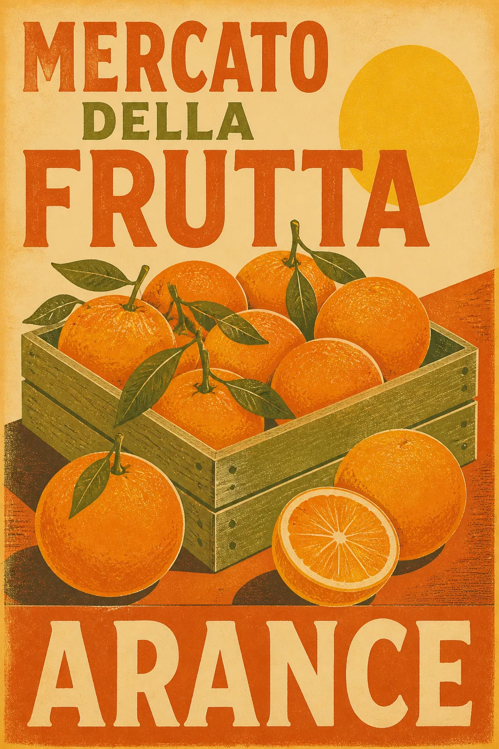
The Subject fills a flat, front-facing wall art print in the Aspect Ratio, with no frame and no surrounding room. Render it in the Art Style, using the Color Palette across the fruit, background, ink and paper. Arrange the oranges in a bold, simplified market-poster composition with strong geometric shapes, confident hand-lettered forms and generous negative space. Place the Text prominently within the artwork, reproducing every word exactly as written, with bold Italian display lettering that feels integrated into the screen-printed design. Use believable ink registration, slightly worn edges, subtle misalignment and visible uncoated paper texture for an authentic sun-faded print. Keep the composition suitable for the Room Style while remaining a complete standalone poster. Print-ready, gallery-quality artwork with crisp legibility, no frame, no mockup, no extra words, no logos, no signatures and no watermark.

Use these details:
Subject: "A crate of oranges and loose oranges arranged like a vintage market display"
Art Style: "Sun-faded 1960s Italian screen print with distressed ink and subtle paper grain"
Color Palette: "Burnt orange, faded terracotta, cream, muted olive green and warm yellow"
Text: "MERCATO DELLA FRUTTA ARANCE"
Aspect Ratio: "2:3 portrait"
Room Style: "Warm Mediterranean kitchen with rustic natural textures"
Using your own logo, product or face? Attach it in the chat and say which of the details it replaces.
Your result will come out close to the example rather than identical to it. Change the details to make it yours.