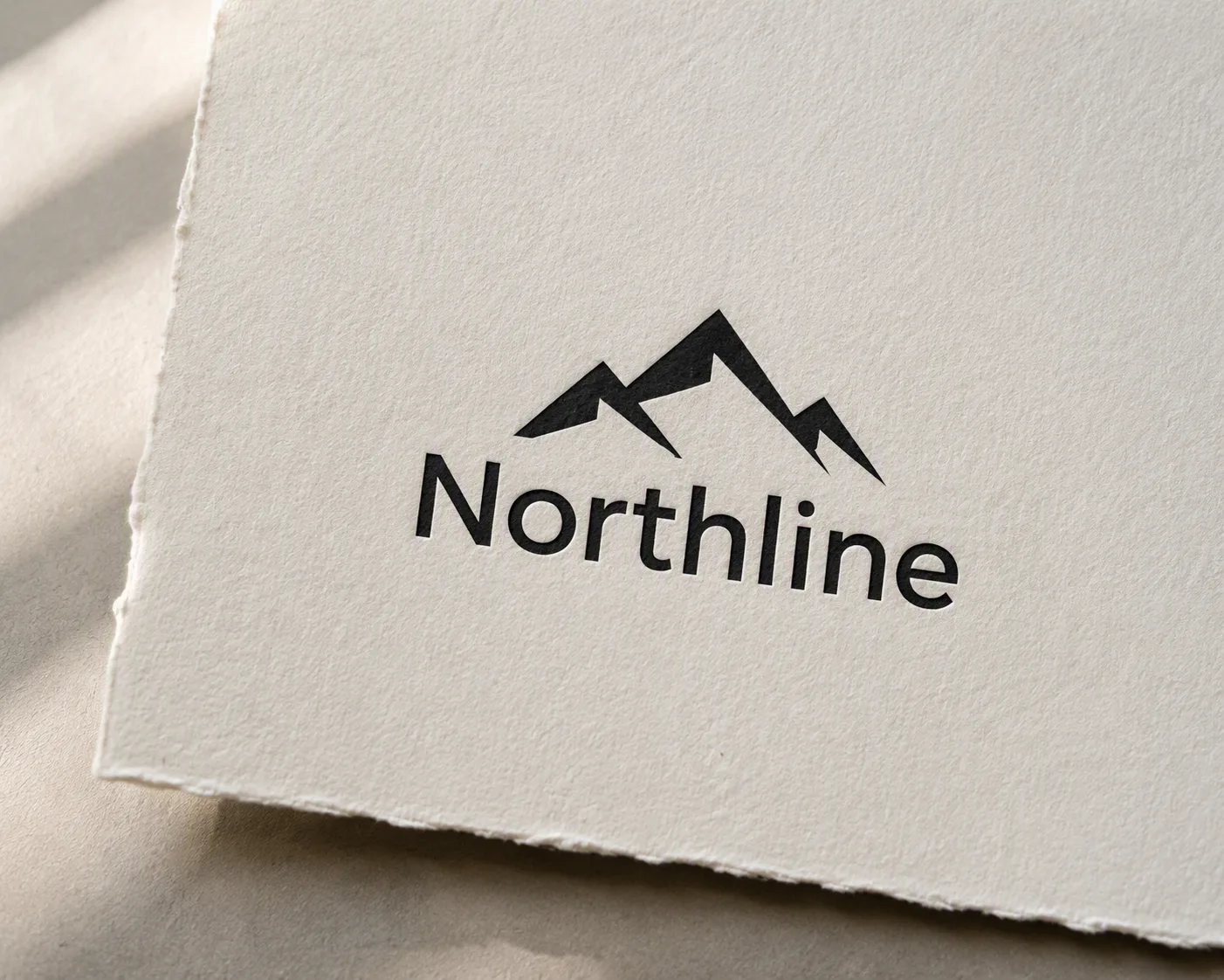
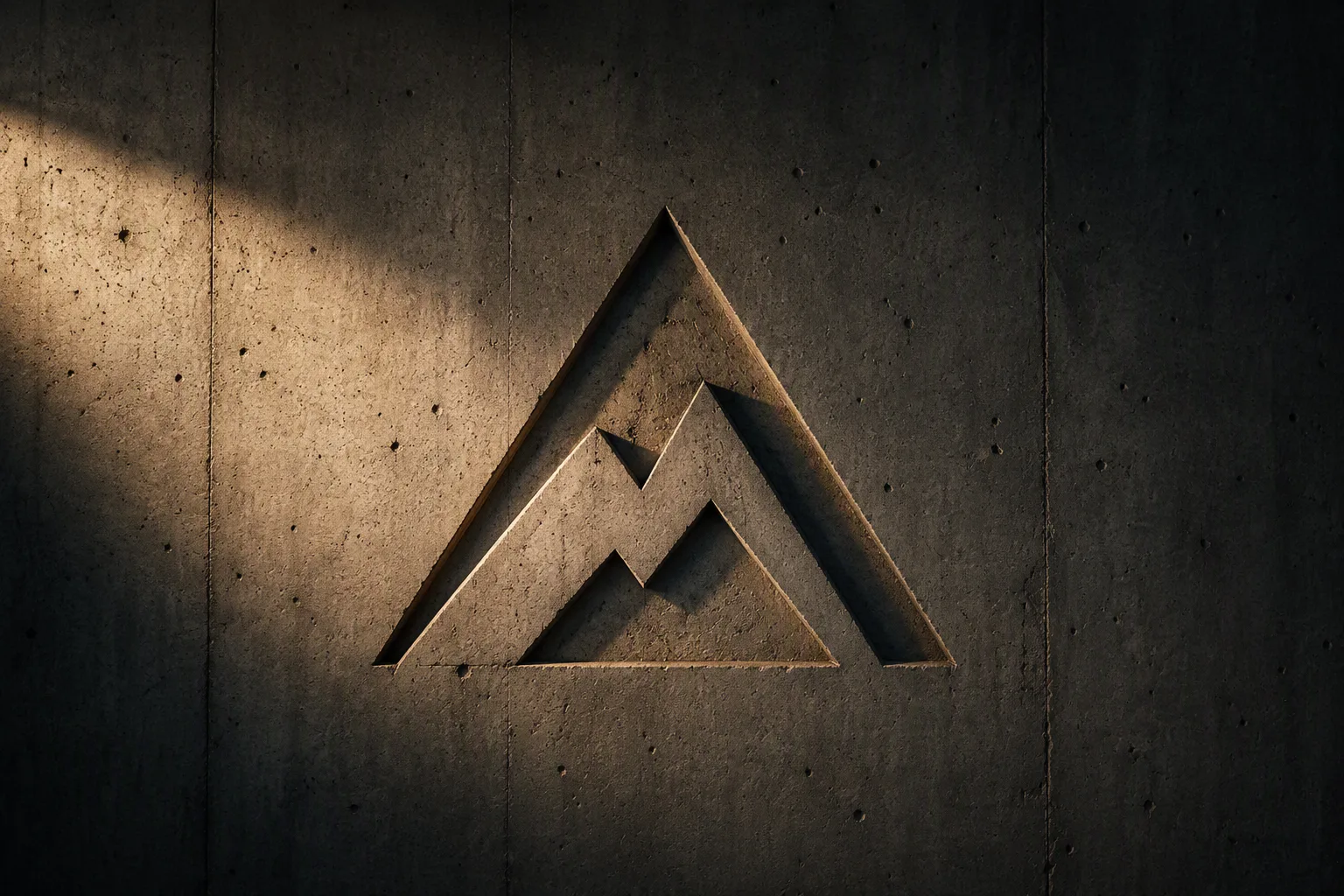
Present the Logo Design as a refined physical logo mockup printed on the Paper Material. Use a close three-quarter overhead composition that shows the paper grain, soft deckled edge, and a small portion of the surrounding surface. Keep the mark crisp, accurately proportioned, and naturally absorbed into the fibers rather than appearing digitally overlaid. Cast a subtle, soft-edged shadow beneath the paper and use diffused window light from one side to reveal the tactile texture without harsh contrast. Neutral, restrained styling with generous negative space, realistic material detail, and editorial stationery photography. Keep the logo fully legible and centered, with no extra objects, decorative elements, or unintended text.

Use these details:
Logo Design: "a simple black geometric mountain emblem with a clean sans-serif wordmark reading 'Northline'"
Paper Material: "natural off-white textured cotton paper"
Using your own logo, product or face? Attach it in the chat and say which of the details it replaces.
Your result will come out close to the example rather than identical to it. Change the details to make it yours.