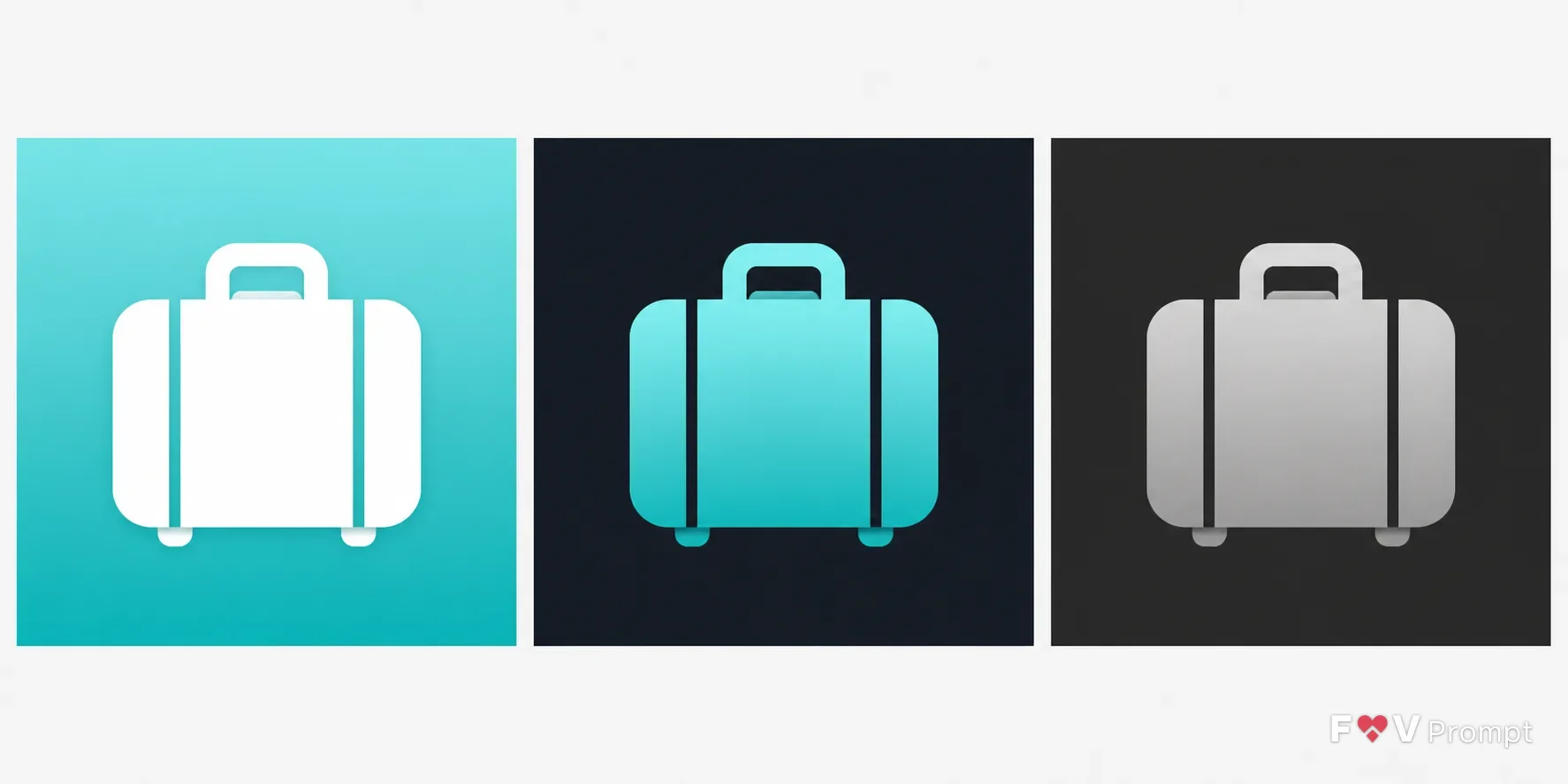
Design a real App Store or Google Play icon for the App Type, centered on the Symbol and following the Style. Use the Colors with a smooth two-tone gradient and a single, bold suitcase silhouette that remains instantly readable at 60 pixels. Keep the symbol inside the central 80 percent with generous padding, no text, and one consistent light direction from above. Fill the entire square 1:1 canvas edge to edge at 1024x1024, with no rounded corners, border, device frame, external shadow or surrounding background. Present the Variant as three identical square icons side by side on a plain neutral background: light as the standard icon, dark with a dark background and colored glyph, and tinted with a monochrome grayscale glyph on dark. Keep the design simple, restrained and professionally art-directed. Avoid sparkles, glow, lens flares, busy backgrounds, extra objects, photographic detail, watermarks and resemblance to existing app icons or logos.

Use these details:
App Type: "Travel planner"
Symbol: "Suitcase"
Style: "Gradient"
Colors: "Turquoise two-tone gradient with a white glyph"
Variant: "Light, dark and tinted icon set"
Using your own logo, product or face? Attach it in the chat and say which of the details it replaces.
Your result will come out close to the example rather than identical to it. Change the details to make it yours.