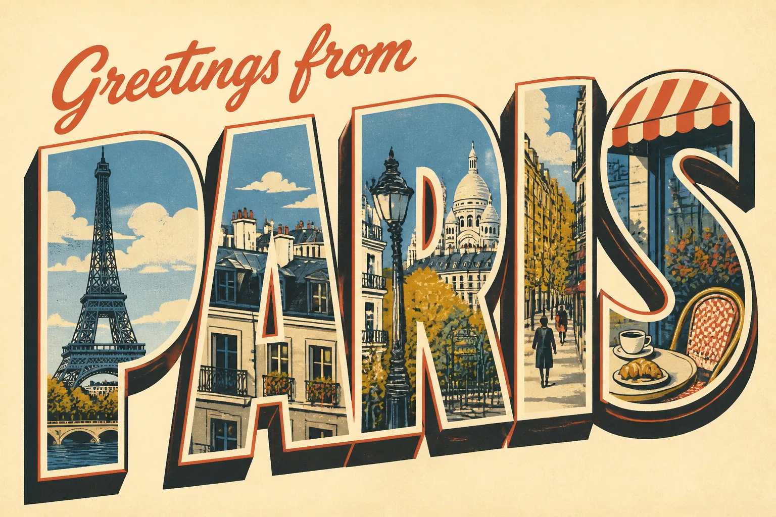
Design the front of the Occasion as a flat, front-facing postcard that fills the frame in the Format. Set the Greeting Text in large, tightly composed block letters as the visual hero, with the Main Illustration integrated inside each letter so the city scenes remain clearly recognizable. Use the Art Style with crisp screen-print edges, subtle ink misregistration, authentic paper grain and the tactile impression of quality card stock. Apply the Color Palette with strong contrast and generous margins around the lettering. Keep the composition unmistakably mid-century, balancing bold display typography with simplified architectural forms and a cheerful travel-poster rhythm. Make every word fully legible and spelled exactly as provided. Include no extra text, addresses, stamp, border clutter, watermark or signature.

Use these details:
Occasion: "Paris travel postcard"
Greeting Text: "Greetings from Paris"
Art Style: "1950s screen-print travel illustration"
Main Illustration: "Large block letters filled with stylized scenes of the Eiffel Tower, Paris rooftops, café tables and tree-lined boulevards"
Color Palette: "sun-washed cream, French blue, coral red, mustard yellow and charcoal"
Format: "3:2 landscape postcard"
Using your own logo, product or face? Attach it in the chat and say which of the details it replaces.
Your result will come out close to the example rather than identical to it. Change the details to make it yours.