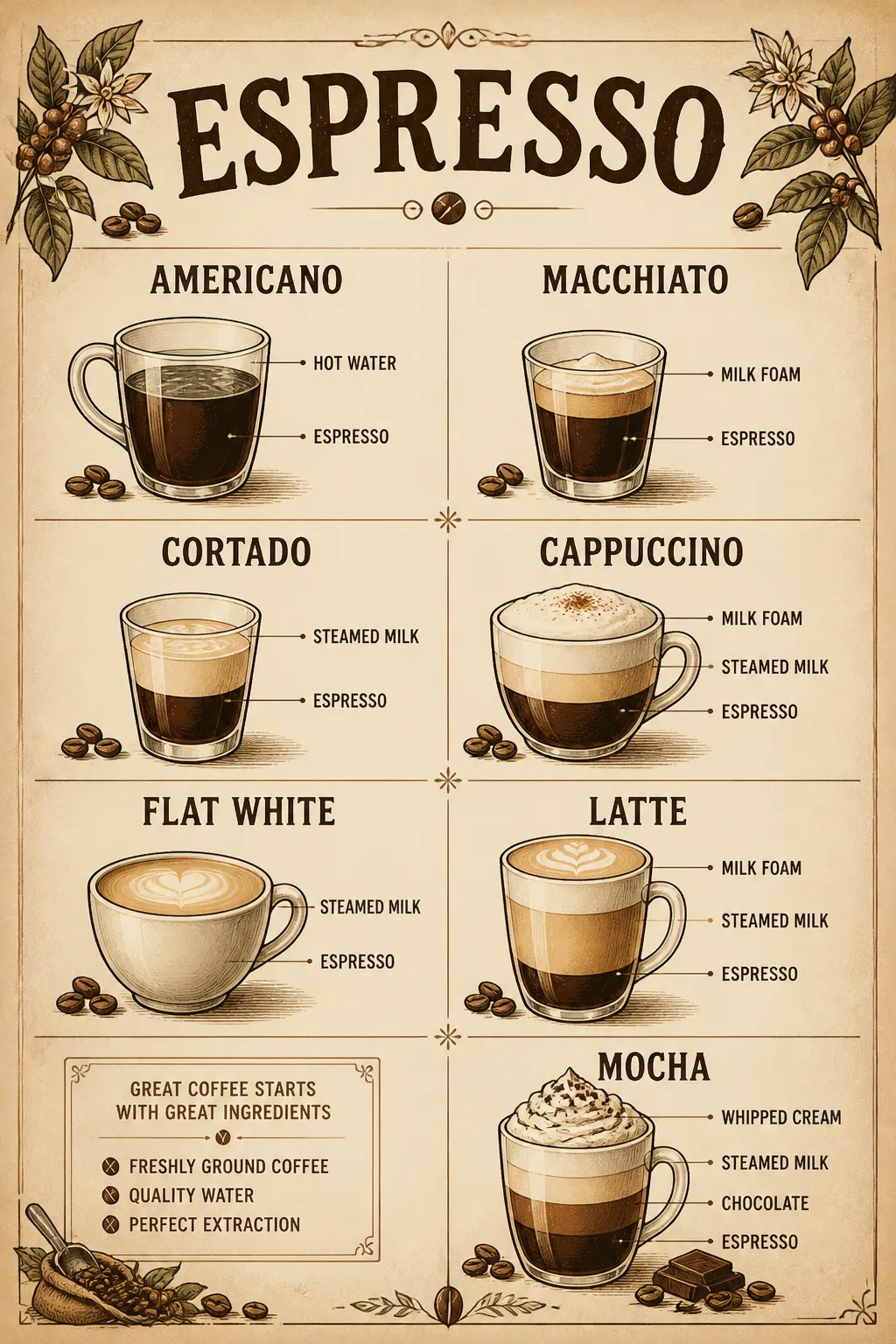
Design the Subject as a finished wall art print shown completely flat and front-facing, filling the frame edge to edge with no frame and no surrounding room. Use the Art Style to create a carefully organized vintage coffee guide with a clear central title area, evenly spaced illustrated drink sections, small decorative coffee botanicals, and concise typographic hierarchy. Render every item in Text exactly as written, with accurate spelling and clean, legible labels. Use the Color Palette consistently across the typography, illustrations and subtle paper accents, while keeping strong contrast for easy reading. Give the artwork the tactile character of a printed poster, with convincing paper grain, slightly imperfect ink registration and restrained aged texture rather than a glossy or digital finish. Let the composition suit the Room Style without depicting the room. Keep the layout balanced, uncluttered and suitable for kitchen decor. Print-ready gallery quality, Aspect Ratio.

Use these details:
Subject: "Espresso drink guide chart for kitchen wall art"
Art Style: "Vintage café reference chart with hand-drawn botanical and coffee illustrations"
Color Palette: "Warm cream, espresso brown, toasted beige and muted cocoa"
Text: ["Espresso", "Americano", "Macchiato", "Cortado", "Cappuccino", "Flat White", "Latte", "Mocha"]
Aspect Ratio: "Portrait 2:3"
Room Style: "Warm rustic kitchen with natural wood and simple ceramics"
Using your own logo, product or face? Attach it in the chat and say which of the details it replaces.
Your result will come out close to the example rather than identical to it. Change the details to make it yours.