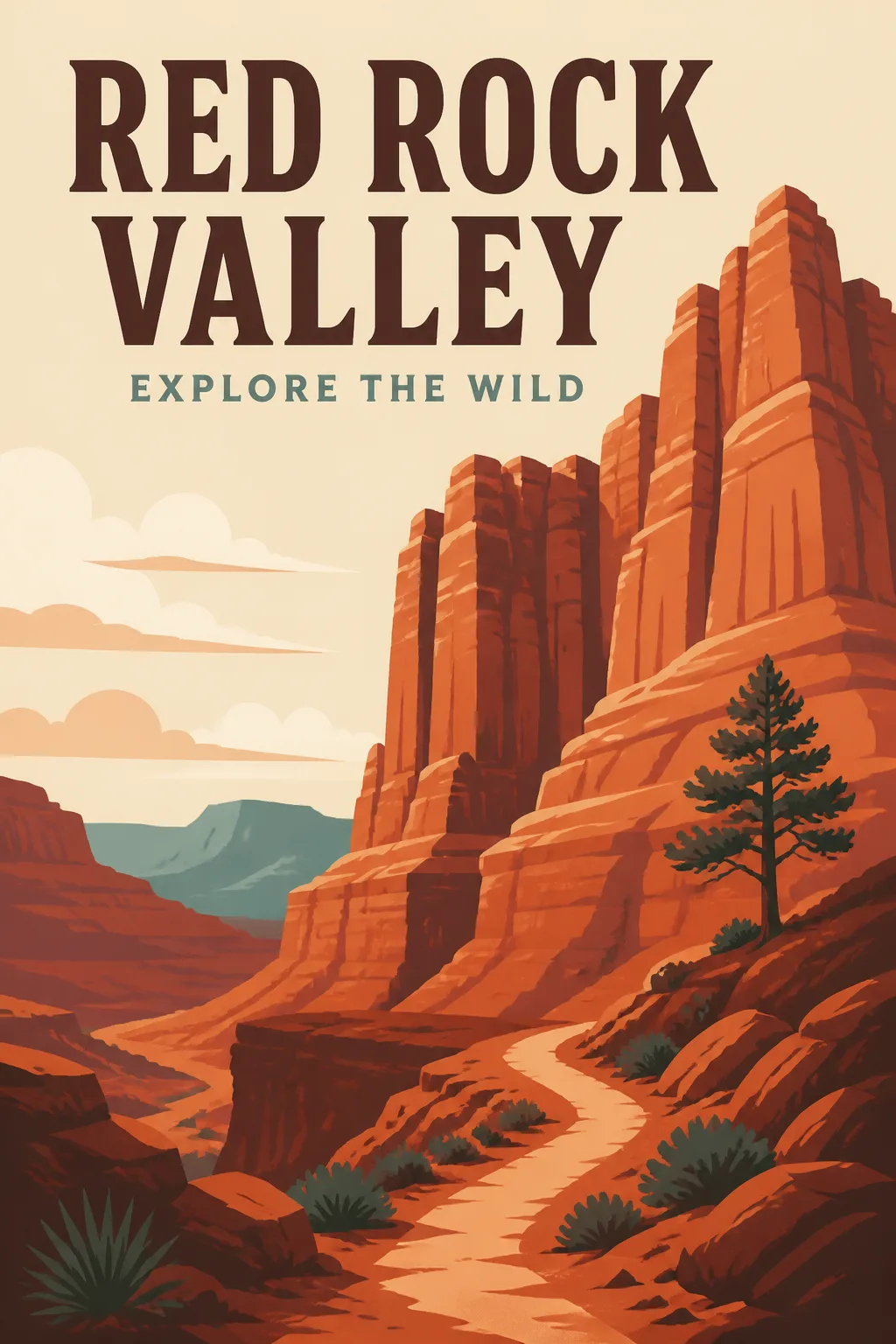
Design a flat portrait national park poster in the Format, shown alone and straight on with no outer border. Build one dominant composition around the Main Visual Subject, simplifying the landscape into bold, clean geometric shapes with clear layers of depth. Use the Color Palette in a limited, intentional way, reserving the strongest contrast for the typography and canyon silhouette. Place the Main Title prominently near the upper third in large, carefully spaced vintage display lettering. Set the Subtitle below it at a smaller scale, keeping the hierarchy clear and the margins generous. Render both text fields exactly as written, with correct spelling. Use the visual language of classic national park travel posters: simplified natural forms, balanced negative space, confident shapes and a screen-printed graphic sensibility without added paper grain or distressed texture. Include no other text, logos, watermarks or QR codes.

Use these details:
Main Title: "Red Rock Valley"
Subtitle: "Explore The Wild"
Main Visual Subject: "A towering red sandstone canyon with layered cliffs, a winding trail and a small lone pine"
Color Palette: "Burnt orange, terracotta, cream, muted teal and deep brown"
Format: "2:3 portrait"
Using your own logo, product or face? Attach it in the chat and say which of the details it replaces.
Your result will come out close to the example rather than identical to it. Change the details to make it yours.