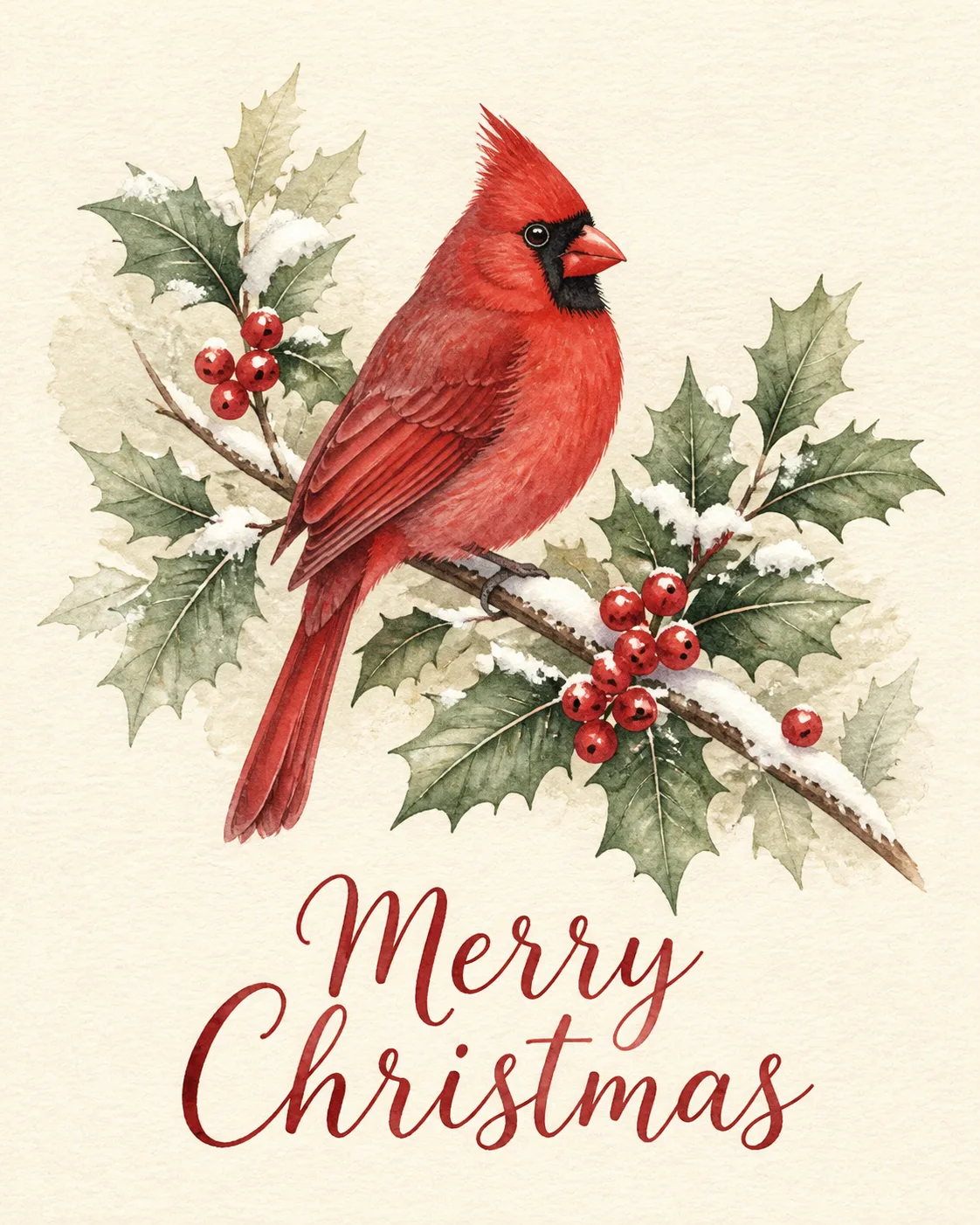
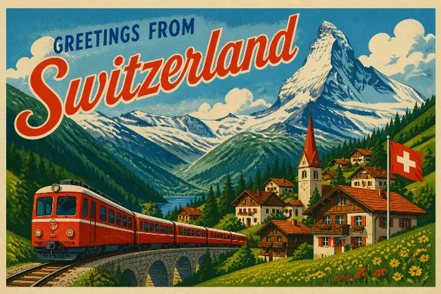
A flat, front-facing greeting card for the Occasion fills the frame in the Format. Use the Art Style to create the Main Illustration as the visual hero, with delicate layered washes, natural pigment variation and believable watercolor paper texture, as if printed on quality card stock. Arrange the composition with generous cream-colored margins and a clear hierarchy: the illustration occupies the upper and central area, while the Greeting Text sits below in soft hand-lettered script. Use the Color Palette throughout, keeping the seasonal artwork balanced and inviting rather than overly saturated. Render the Greeting Text exactly as written, in English, with every word fully legible and correctly spelled. Keep the design uncluttered, with no extra text, random sparkles, glowing effects, lens flares, plastic 3D elements, watermark or signature.

Use these details:
Occasion: "Christmas"
Greeting Text: "Merry Christmas"
Art Style: "Soft botanical watercolor with hand-lettered typography"
Main Illustration: "A red cardinal perched on a snowy holly branch"
Color Palette: "Cardinal red, evergreen, snowy white, muted sage and warm cream"
Format: "4:5 portrait"
Using your own logo, product or face? Attach it in the chat and say which of the details it replaces.
Your result will come out close to the example rather than identical to it. Change the details to make it yours.