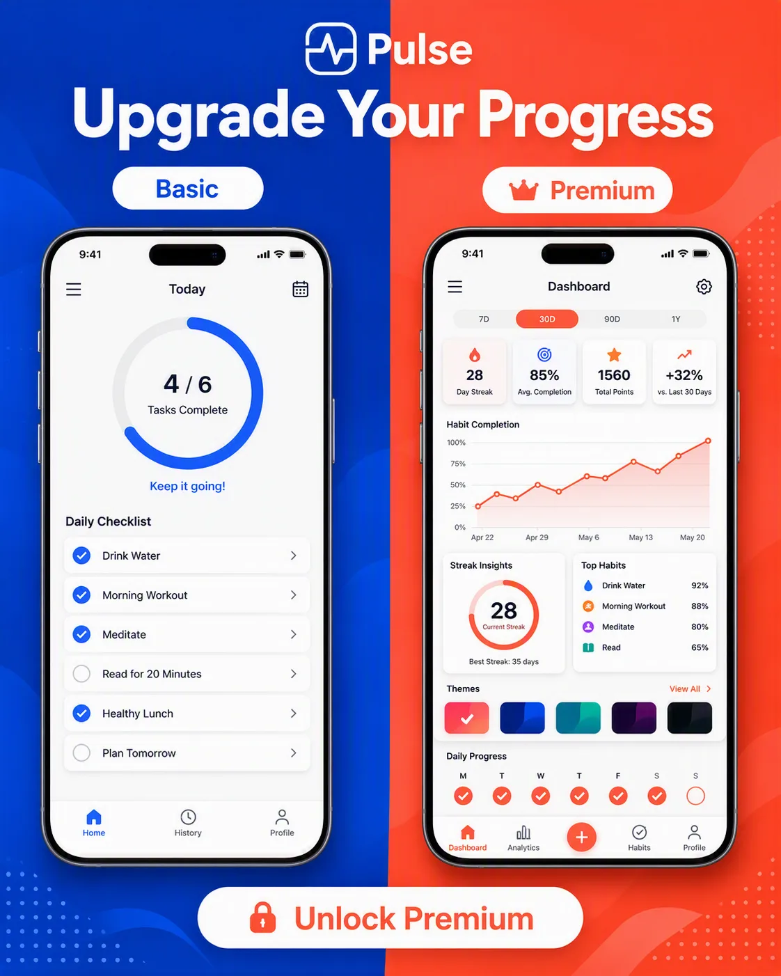
Design a split-screen product tier announcement for the App Name, formatted as the Format. Divide the composition into two equal vertical sections with a clear visual contrast between the Basic Tier Label and the Premium Tier Label. Use the Color Palette for the bold two-tone background, interface accents, dividers, and typography while keeping both app views legible and clean.

Place the Headline prominently across the upper portion, then show the Basic App View on the left and the Premium App View on the right as distinct smartphone-style app interface mockups. Make the basic screen feel streamlined and limited, while the premium screen feels more capable through richer data, additional controls, and layered dashboard cards. Add the matching tier labels above each view and place the Call To Action near the bottom. Use crisp sans-serif typography, precise alignment, generous spacing, subtle shadows, and realistic UI details. Render every field exactly as written, with no misspelled text or extra labels.

Use these details:
App Name: "Pulse"
Basic Tier Label: "Basic"
Premium Tier Label: "Premium"
Basic App View: "Simple habit tracker with a daily checklist, progress ring, and limited color accents"
Premium App View: "Expanded habit dashboard with analytics, streak insights, custom themes, and detailed progress charts"
Headline: "Upgrade Your Progress"
Call To Action: "Unlock Premium"
Color Palette: "cobalt blue and vivid coral with white interface panels"
Format: "4:5 Instagram post"