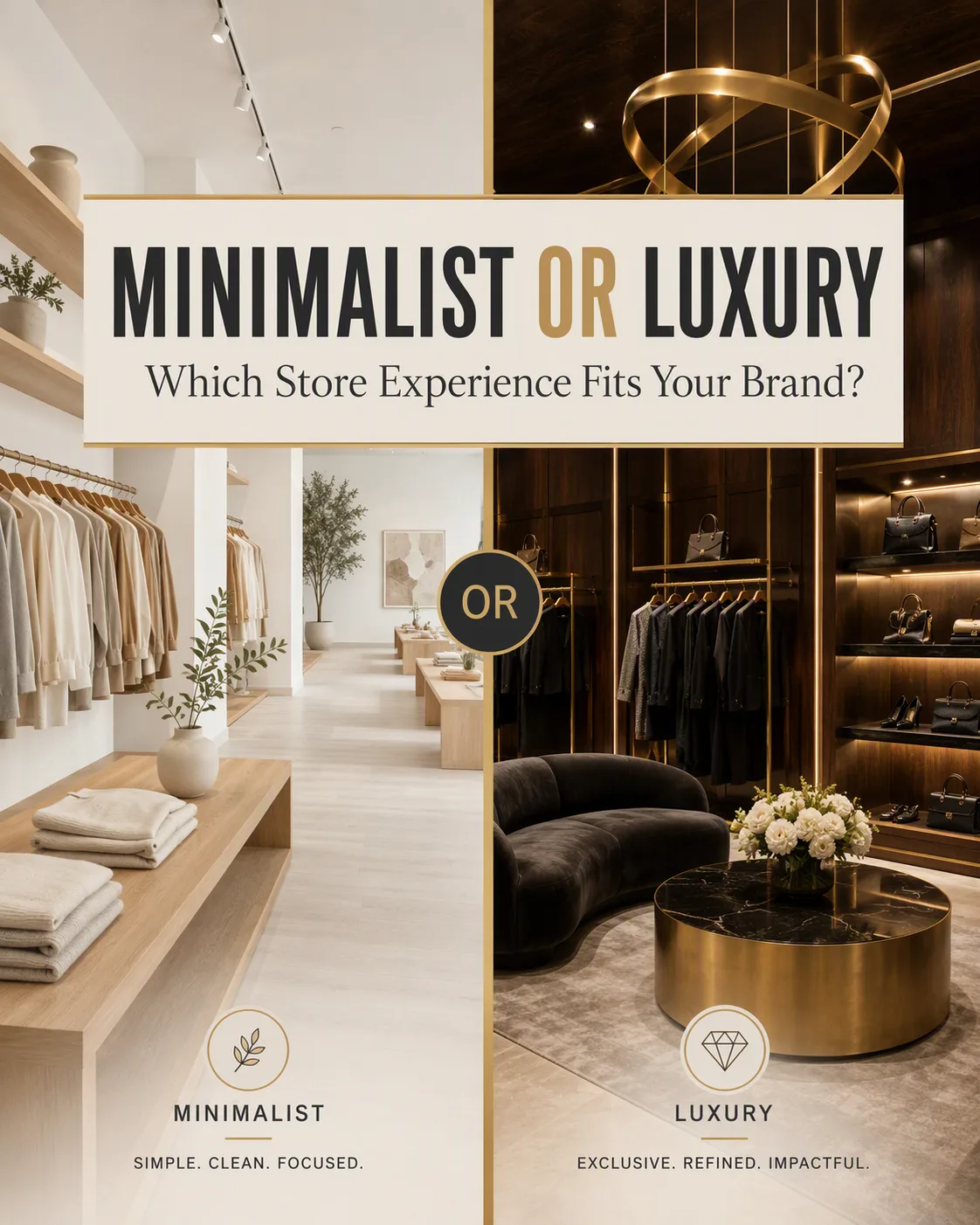
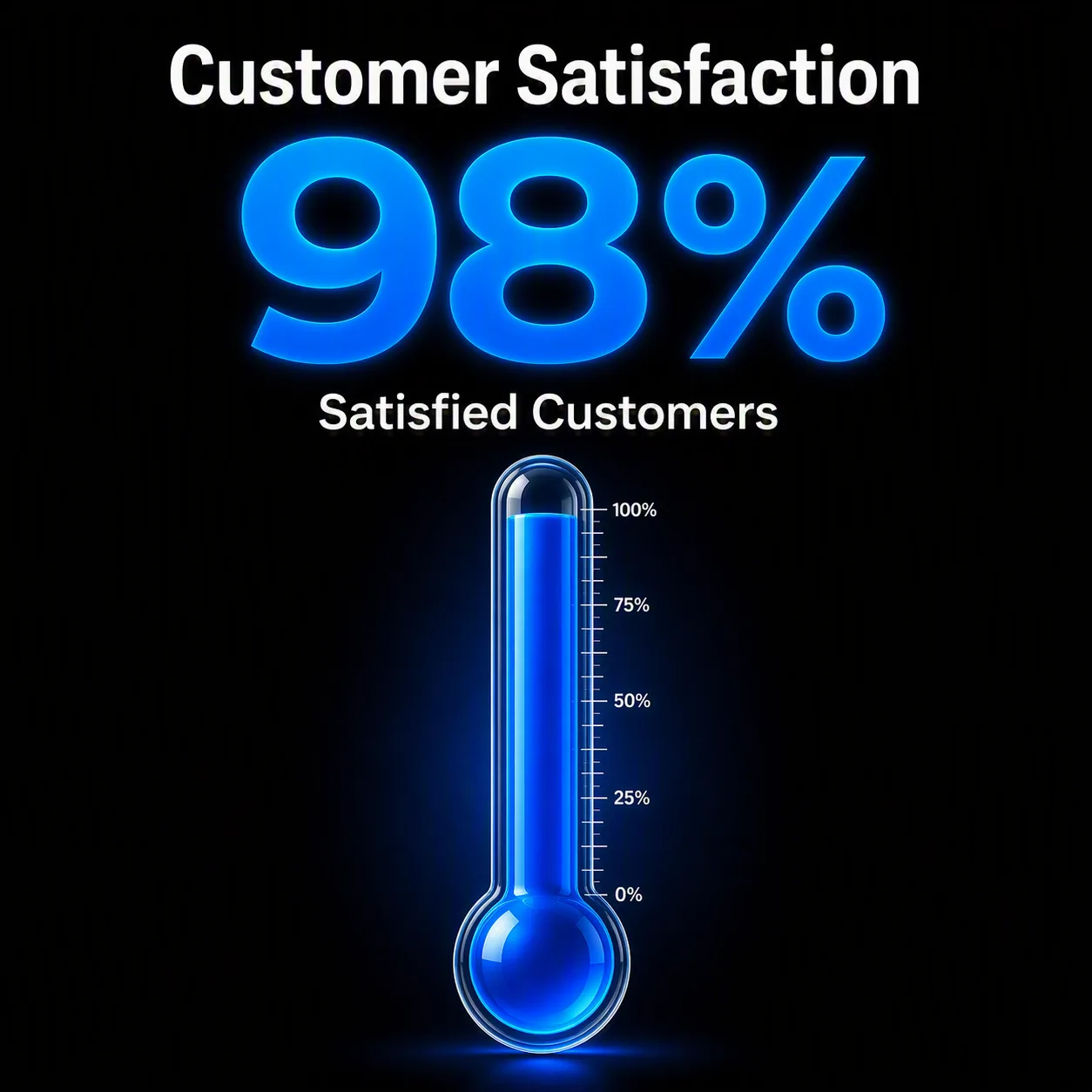
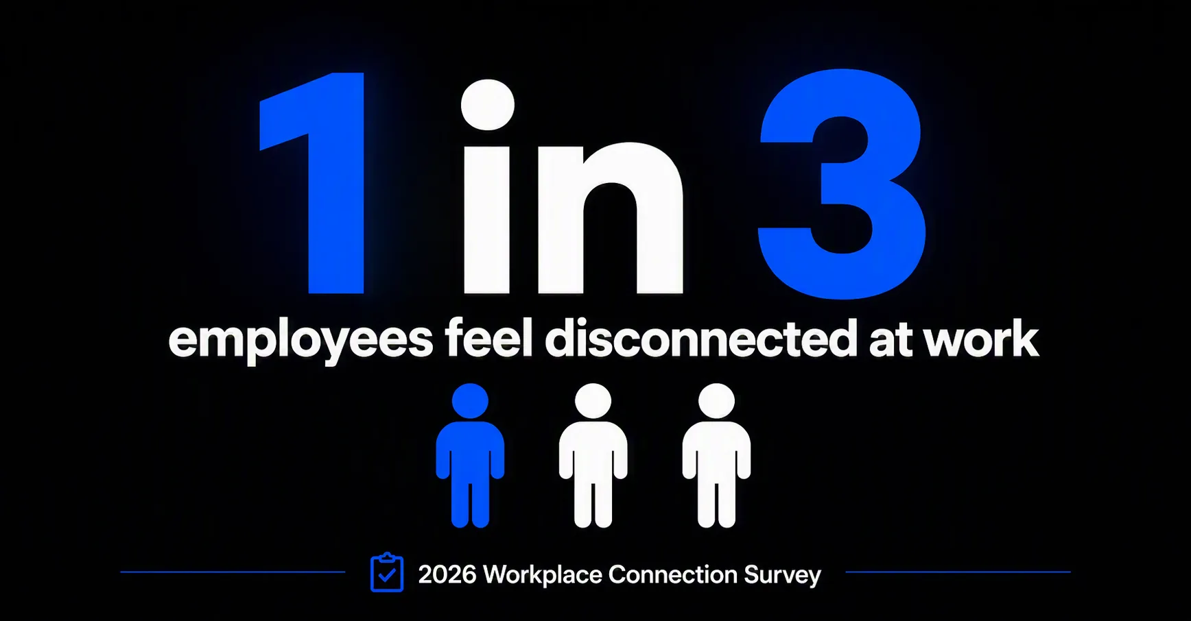
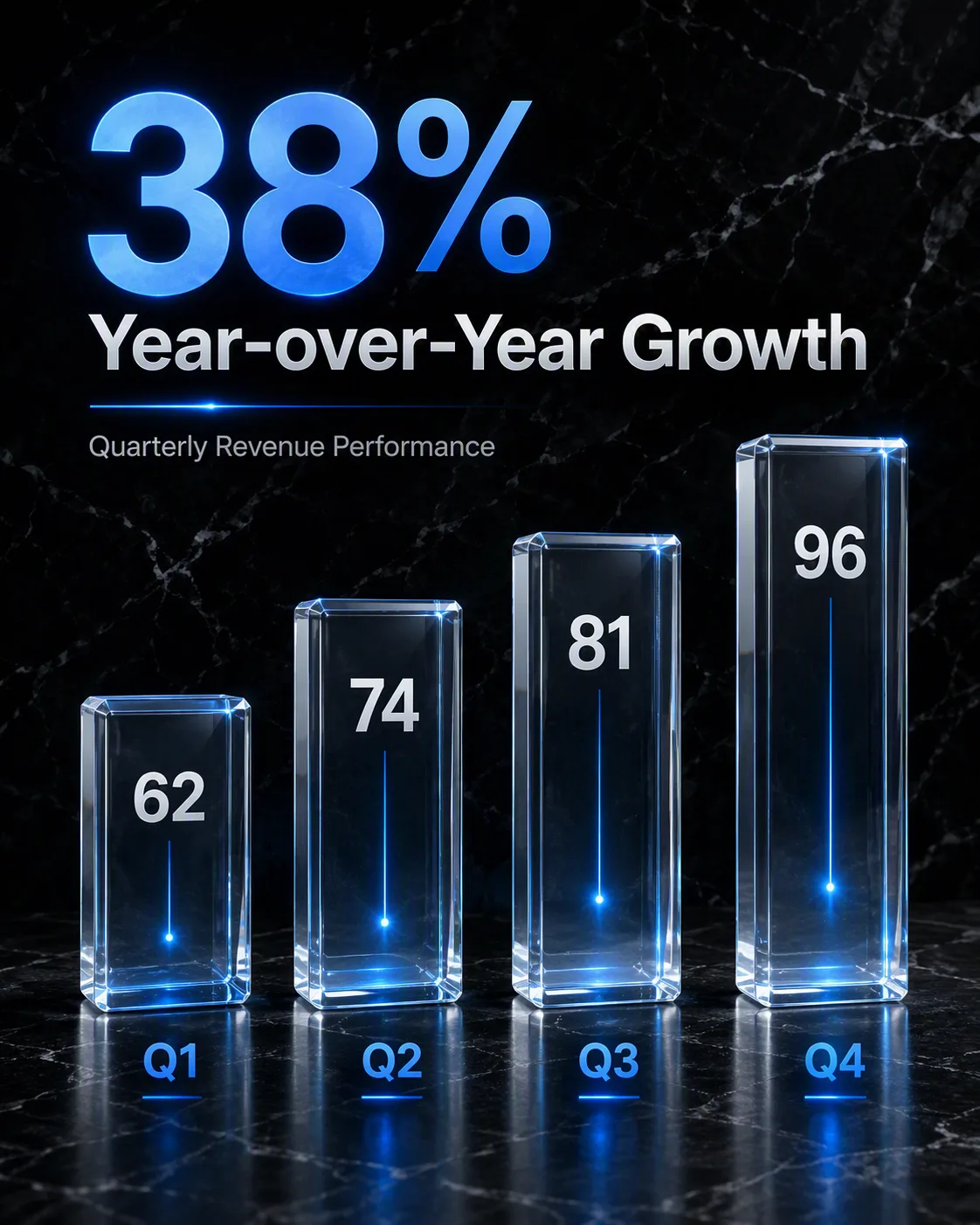
Build a split-screen retail comparison graphic in the Format. Show the Minimalist Store Interior on the left and the Luxury Store Interior on the right, with a clean vertical divide that makes the contrast immediately clear. Use editorial interior photography, balanced perspective, realistic materials and carefully controlled lighting in both halves. Place the Headline prominently across the center or upper third in bold, highly legible typography, ensuring every word is rendered exactly as written. Use the Color Palette consistently across the interiors, divider, typography and small graphic accents. Keep the composition uncluttered, with enough negative space for the headline and a clear visual hierarchy suited to an Instagram feed. Make the two experiences feel intentionally different while keeping the overall post cohesive. Avoid distorted architecture, unreadable text, cluttered displays and inconsistent perspective.

Use these details:
Minimalist Store Interior: "Bright Scandinavian clothing store with white walls, pale oak fixtures, open shelving and carefully spaced neutral garments"
Luxury Store Interior: "opulent fashion boutique with dark walnut walls, brushed brass displays, velvet seating and dramatic sculptural lighting"
Headline: "MINIMALIST OR LUXURY Which Store Experience Fits Your Brand?"
Color Palette: "warm white, charcoal, muted beige and brushed gold"
Format: "4:5 Instagram post"