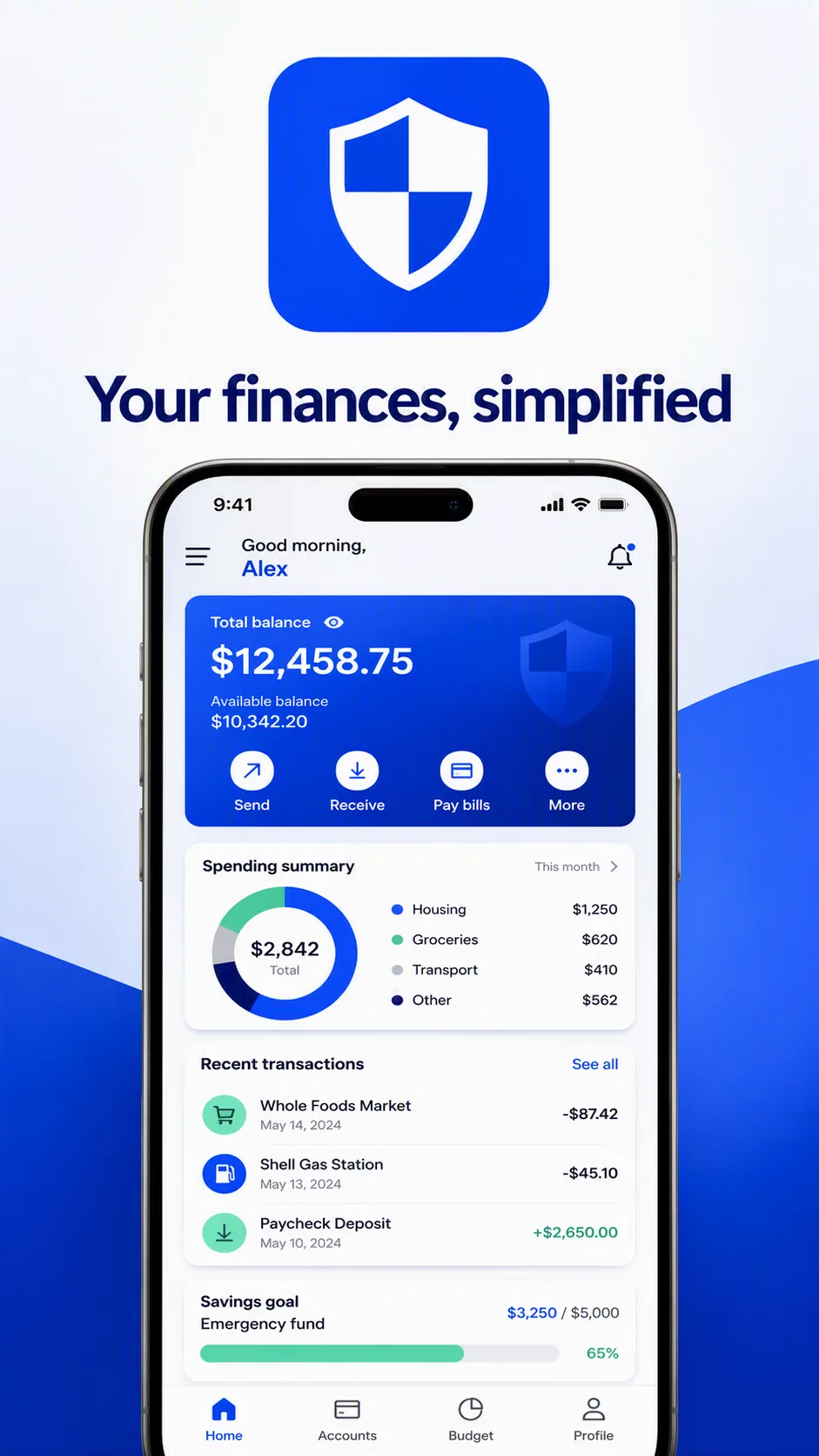
Build a clean app marketing visual for a banking app in the Format. Place the App Icon prominently at the center of the upper half, with generous spacing and crisp edges. Render the Tagline exactly as written beneath it in large, highly legible typography. Show the Banking Screen below as a convincing mobile interface with clear hierarchy, realistic card spacing, refined icons and readable interface text. Use the Color Palette consistently across the icon, interface, background and typography, with strong contrast and a calm, trustworthy mood. Keep the composition balanced and uncluttered, with subtle depth behind the interface but no distracting decorative elements. Make the entire design feel ready for an app store or mobile advertising campaign. Ensure every visible word is correctly spelled and the Tagline remains exactly unchanged.

Use these details:
App Icon: "bold cobalt blue square icon with a clean white shield and subtle rounded corners"
Tagline: "Your finances, simplified"
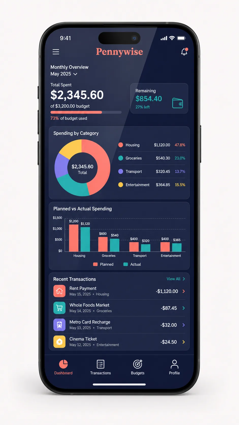
Banking Screen: "modern mobile banking dashboard showing a balance card, spending summary, recent transactions and a simple savings progress indicator"
Color Palette: "cobalt blue, white, soft gray and mint green"
Format: "9:16 vertical"