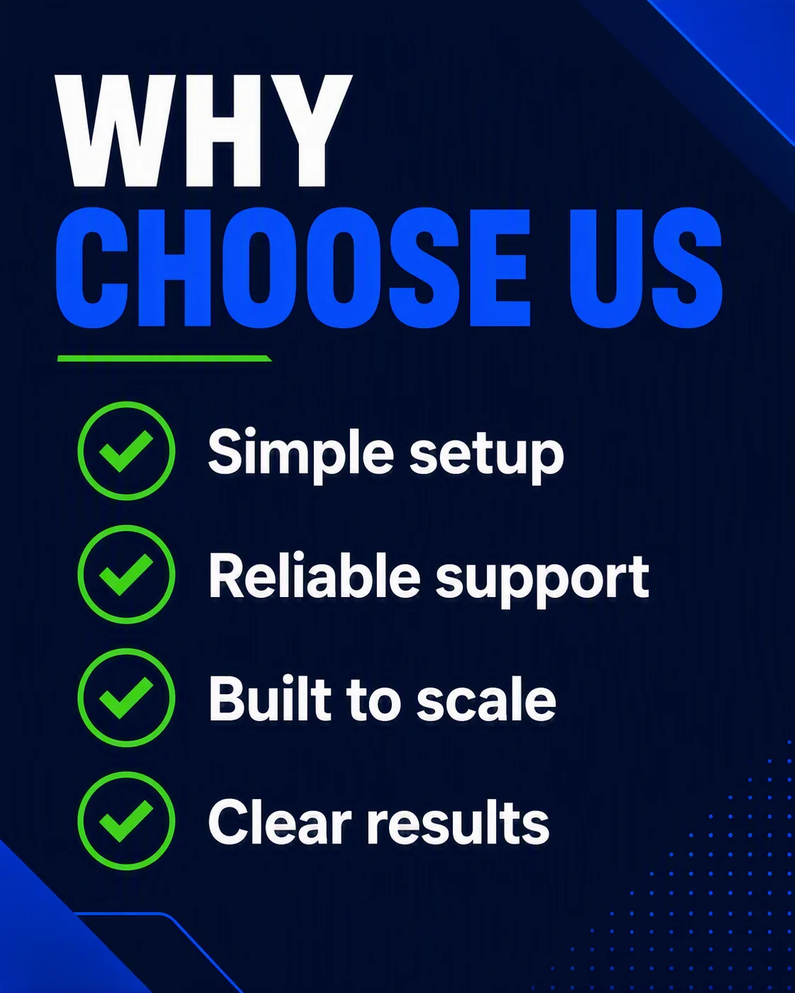
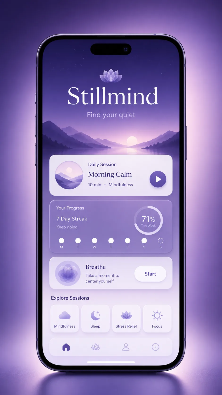
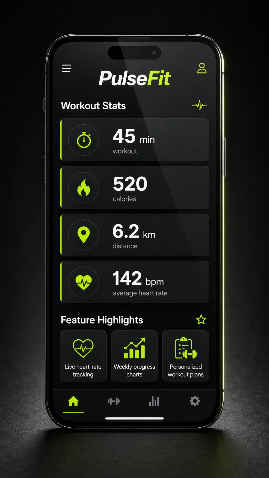
Build a bold LinkedIn marketing graphic in the Format. Use the Headline as the dominant typographic element near the top, with strong sans-serif lettering and clear visual hierarchy. Below it, arrange the Benefit Points as a clean vertical checklist, giving each line a prominent, crisp checkmark icon and generous spacing. Use the Color Palette across the background, typography, checkmarks and subtle accent shapes. Set the composition on a deep dark navy field with restrained geometric details, strong contrast and ample negative space. Keep every word legible at mobile size, align the checklist precisely, and maintain a confident, modern app-marketing feel. Render the Headline and every item in Benefit Points exactly as written. Avoid clutter, decorative illustrations, tiny text and spelling errors.

Use these details:
Headline: "Why Choose Us"
Benefit Points: ["Simple setup", "Reliable support", "Built to scale", "Clear results"]
Color Palette: "dark navy, electric blue, white and vivid green"
Format: "4:5 vertical LinkedIn post"