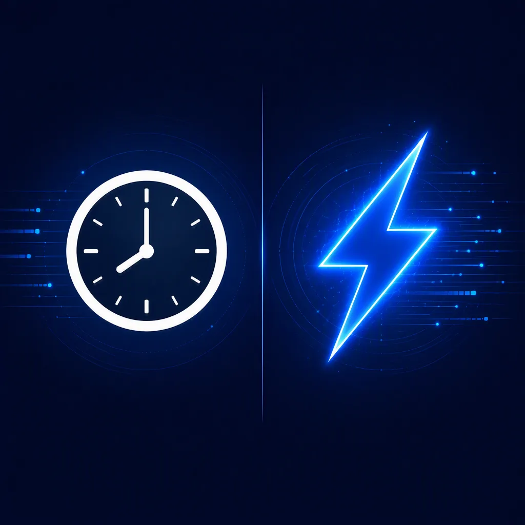
Arrange the Clock Icon and Lightning Bolt Icon as a clear visual comparison on a deep navy background, with the two symbols balanced on opposite sides of a slim vertical divider. Give the lightning bolt a subtle electric glow and the clock a crisp, dependable presence, suggesting the contrast between time and speed in modern software. Add restrained motion cues such as fine data trails, small interface-inspired lines and a soft radial light behind each icon, while keeping the layout spacious and easy to read at feed size. Use the Color Palette with strong contrast, clean geometric forms and a contemporary technology brand feel. Do not add words, logos or extra symbols. Render the composition in the Format with sharp edges, even spacing and a refined LinkedIn graphic finish.

Use these details:
Clock Icon: "a clean white clock symbol"
Lightning Bolt Icon: "a vivid electric-blue lightning bolt symbol"
Color Palette: "deep navy, white and electric blue"
Format: "1200 x 627 pixels, landscape LinkedIn post"