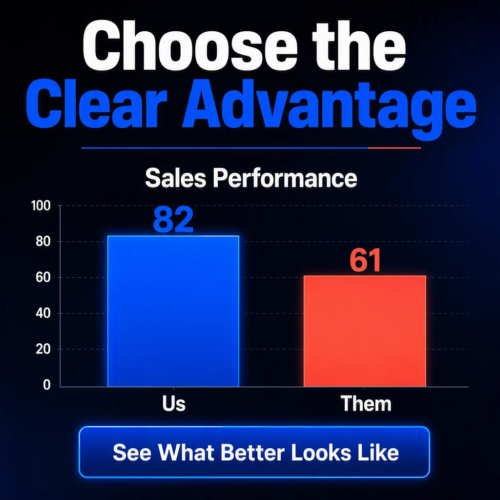
Build a sales pitch graphic in the Format with a dark, confident visual direction. Place the Headline prominently at the top, followed by the Chart Title above a simple two-bar comparison chart. Label the bars exactly with the Us Label and Them Label, and use the Us Value and Them Value as the displayed bar values. Make the comparison immediately readable, with the stronger result visually emphasized through scale, contrast, and placement without distorting the data. Use the Brand Colors consistently for the bars, headline accents, and small graphic details. Use the Background across the full canvas. Add the Call To Action in a clear button-like area near the bottom. Use bold sans-serif typography, generous spacing, crisp edges, and restrained geometric accents. Render every supplied text element exactly as written, with no extra copy, logos, icons, or decorative clutter.

Use these details:
Headline: "Choose the Clear Advantage"
Chart Title: "Sales Performance"
Us Label: "Us"
Them Label: "Them"
Us Value: "82"
Them Value: "61"
Brand Colors: "electric blue and vivid coral"
Background: "charcoal black with a subtle navy gradient"
Call To Action: "See What Better Looks Like"
Format: "4:5 Instagram post"
Using your own logo, product or face? Attach it in the chat and say which of the details it replaces.
Your result will come out close to the example rather than identical to it. Change the details to make it yours.