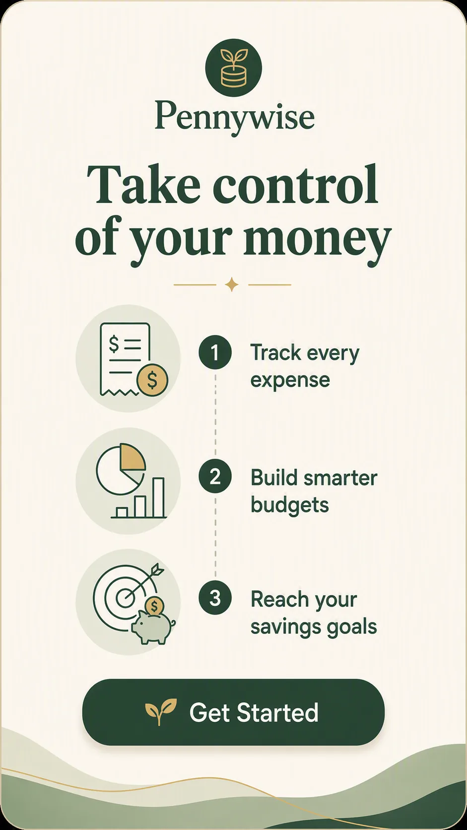
Design a clean how-it-works onboarding screen for the finance app, using the App Name at the top and the Headline as the main message. Arrange three simple, friendly line icons in a vertical sequence, pairing one icon with each item in the Onboarding Steps. Use clear visual hierarchy, generous spacing and thin divider lines or subtle connectors to guide the eye from the first step to the third. Add the Button Label inside a rounded button near the bottom. Use the Color Palette across the background, icons, typography and button, with strong contrast for easy mobile reading. Keep the composition centered within the Format, with rounded corners, restrained shadows and a calm contemporary fintech aesthetic. Render all text exactly as written, with accurate spelling and no extra copy.

Use these details:
App Name: "Pennywise"
Onboarding Steps: ["Track every expense", "Build smarter budgets", "Reach your savings goals"]
Headline: "Take control of your money"
Button Label: "Get Started"
Color Palette: "warm cream, deep forest green, muted sage and soft gold"
Format: "9:16 vertical mobile screen"
AI models never repeat themselves exactly, so your result will differ from the one here. Change the details to make it yours.