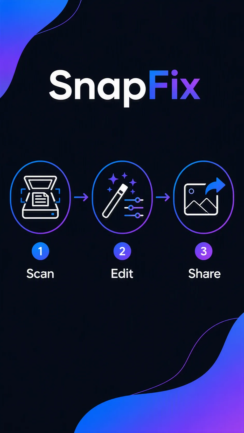
Design a vertical how-it-works screen for the photo editor app named App Name. Place the app name at the top with generous breathing room, followed by a centered three-step icon row using the Step Labels and matching Step Icons in order. Give each step a simple, instantly recognizable line icon, a clear label beneath it, and subtle connecting lines or arrows to guide the eye from left to right. Use the Color Palette across the background, icons, labels and accents, maintaining strong contrast and a clean mobile-app interface. Keep the composition uncluttered, balanced and easy to scan at phone size. Use crisp vector shapes, consistent stroke weights, restrained rounded corners and precise typography. Render every label exactly as written, with no extra words, in the Format.

Use these details:
App Name: "SnapFix"
Step Labels: ["Scan", "Edit", "Share"]
Step Icons: ["A document scanner icon", "A magic wand with adjustment sliders", "A share arrow leaving a photo frame"]
Color Palette: "electric blue, violet, white and charcoal"
Format: "9:16 vertical"
AI models never repeat themselves exactly, so your result will differ from the one here. Change the details to make it yours.