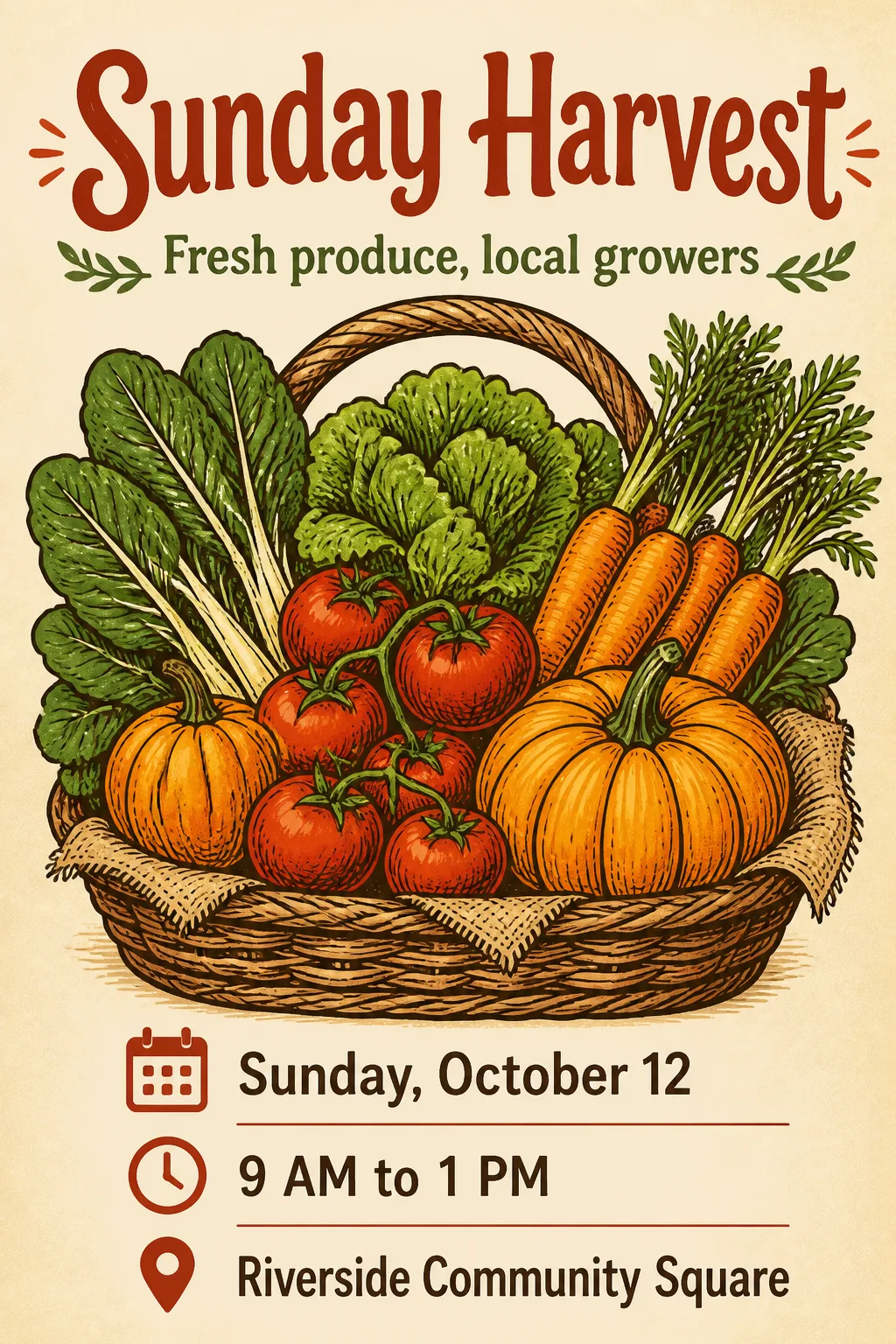
Build a flat, front-facing farmers market poster in the Format, with one clear illustration-led composition and generous margins. Use the Main Visual Subject as the dominant central image, drawn with clean organic shapes and confident ink-like outlines. Apply the Color Palette consistently across the illustration, lettering and small accents. Set the Main Title large near the top with deliberate, friendly display typography, then place the Subtitle beneath it at a smaller scale. Group the Date, Time and Venue together near the bottom as three concise detail lines with strong alignment and clear spacing. Keep the hierarchy immediate: title first, illustration second, event information third. Use a warm, print-ready graphic design with crisp edges and subtle paper texture, but no extra decorative clutter. Render every text field exactly as written and spell every word correctly. Show only the poster, straight on and full frame, with no mockup, watermark, logo, QR code or outer image border.

Use these details:
Main Title: "Sunday Harvest"
Subtitle: "Fresh produce, local growers"
Date: "Sunday, October 12"
Time: "9 AM to 1 PM"
Venue: "Riverside Community Square"
Main Visual Subject: "A hand-drawn basket overflowing with tomatoes, carrots, leafy greens and pumpkins"
Color Palette: "tomato red, leafy green, pumpkin orange, cream and deep brown"
Format: "2:3 portrait"
Using your own logo, product or face? Attach it in the chat and say which of the details it replaces.
Your result will come out close to the example rather than identical to it. Change the details to make it yours.