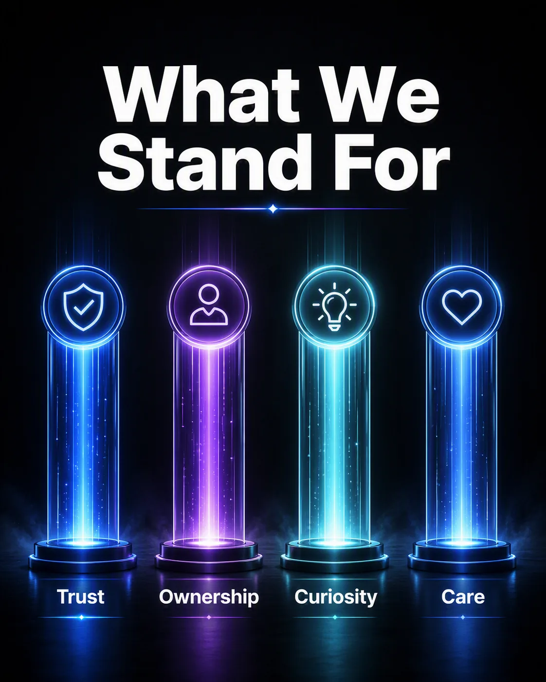
Build a bold corporate culture graphic around four evenly spaced glowing pillars, each representing one of the Core Values. Place the Headline prominently above them in large, heavy white sans-serif typography, with clear hierarchy and generous spacing. Give each pillar a distinct luminous core, soft atmospheric bloom and subtle vertical light trails, while keeping the overall arrangement symmetrical and easy to scan. Use the Background to create depth and apply the Color Palette consistently across the pillars, accents and restrained background glow. Keep the composition centered with strong negative space, crisp edges and a refined editorial feel. Render all value labels and the Headline exactly as written, with accurate spelling and clean letterforms. Make the final artwork in the Format.

Use these details:
Core Values: ["Trust", "Ownership", "Curiosity", "Care"]
Headline: "What We Stand For"
Background: "deep charcoal black with a subtle radial vignette"
Color Palette: "electric blue, violet, soft cyan and white"
Format: "4:5 Instagram post"