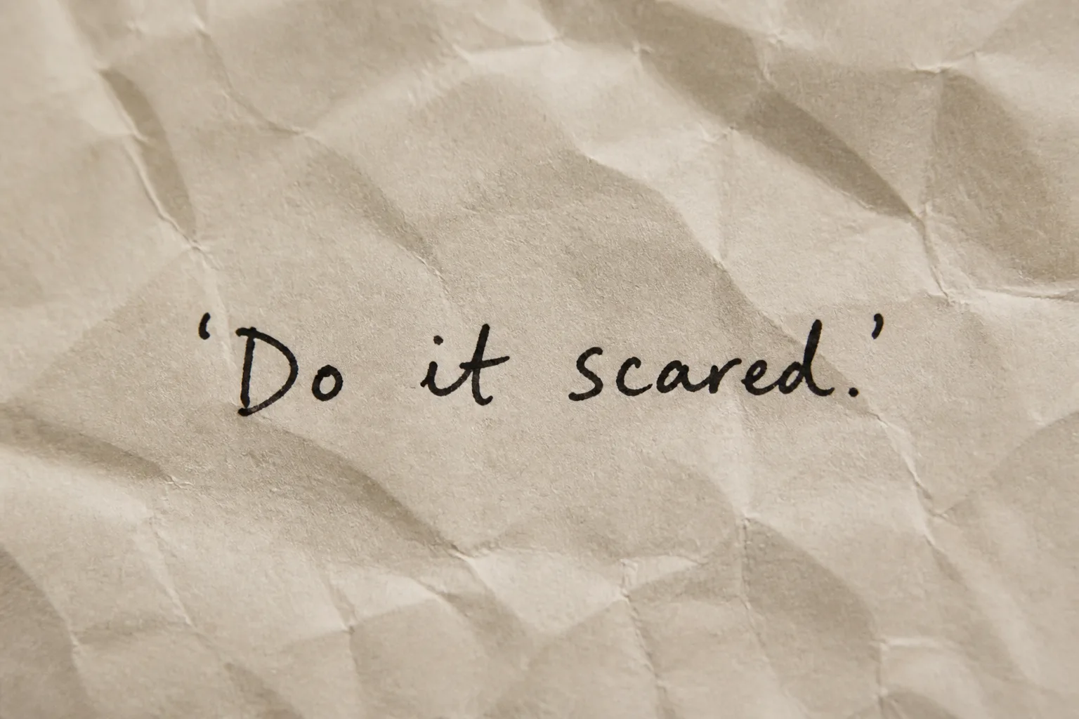
Set the Quote in a single line of natural handwritten lettering across roughly 55 to 75 percent of the frame, rendering it exactly as written, including quotation marks and punctuation. Show the writing in the Ink Color on the Paper Texture, seen in a close-up crop with generous uneven margins and visible creases. Use the Lighting to cast a soft, diffused shadow across the paper without obscuring any letters. Keep one handwritten type style, slightly imperfect ink edges, realistic pressure variation, and believable paper fibers. Let the Paper Texture fill the frame with no other objects. The result should feel like an intimate phone-camera or film photograph, with subtle natural grain and gentle tonal variation. Keep the quote comfortably readable at thumbnail size, with capital letter height around 4 to 6 percent of the image height. No extra words, decorations, logos, borders, or watermark.

Use these details:
Quote: "'Do it scared.'"
Paper Texture: "crumpled cream paper"
Ink Color: "black ink"
Lighting: "soft diffused shadow"
Using your own logo, product or face? Attach it in the chat and say which of the details it replaces.
Your result will come out close to the example rather than identical to it. Change the details to make it yours.