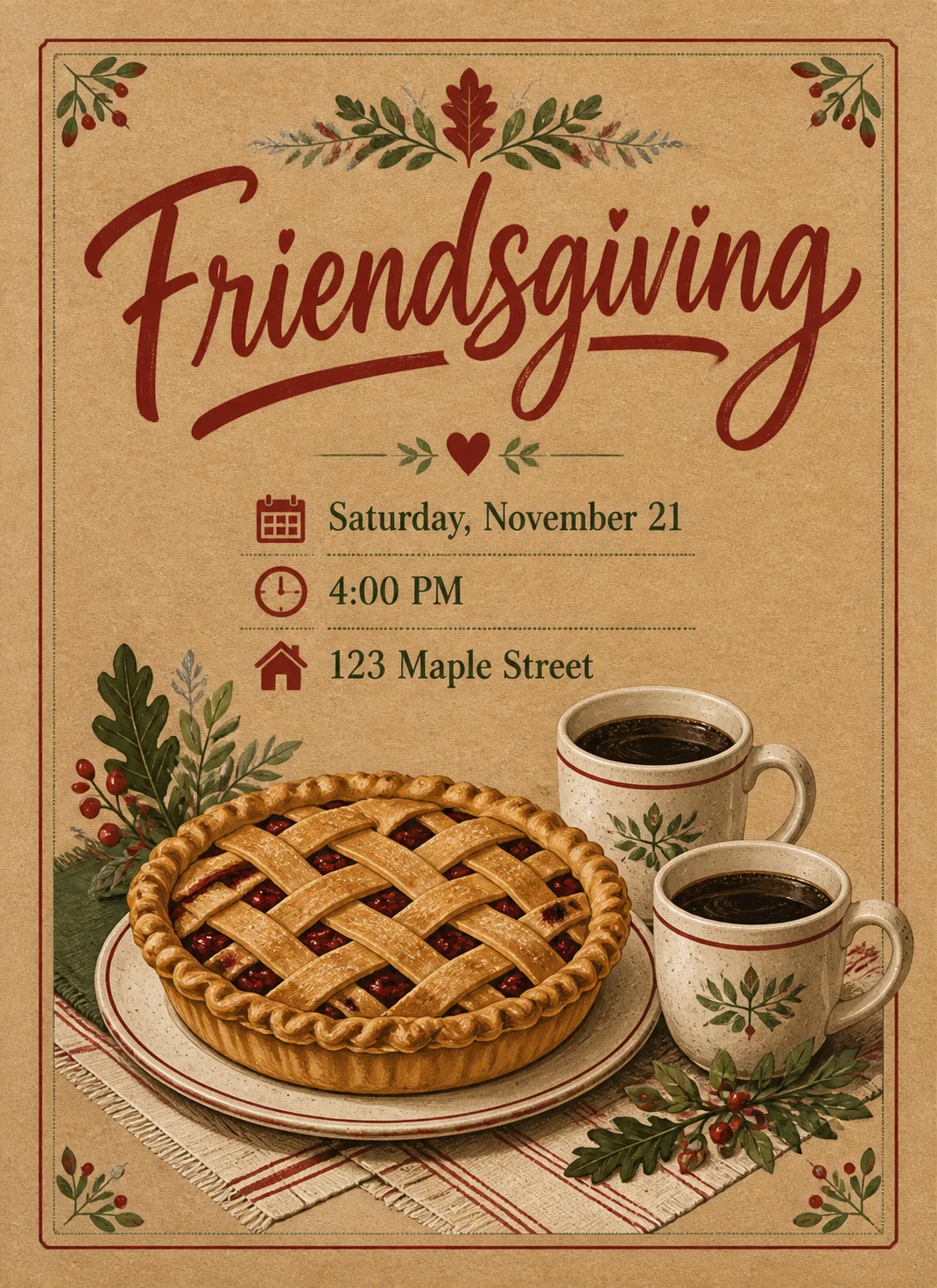
Design a front-facing printed invitation in the Format, with a generous margin on every side and nothing touching the edges. Make the illustration the hero: a freshly baked pie on a simple plate beside two coffee cups, arranged in a friendly tabletop still life that reflects the Theme. Use a convincing kraft paper texture as the background, with crisp printed detail and subtle retro print character rather than a glossy or plastic finish. Apply the Color Palette in restrained blocks, paper textures and small decorative accents. Set the Title as the largest element in expressive hand-lettered typography, rendering it exactly as written and keeping every letter fully legible. Beneath it, add no more than three short detail lines, each rendered exactly as written: Date, Time and Address. Use a clear typographic hierarchy, English only, correct spelling and theme-appropriate lettering. Keep the design cozy but not washed in yellow light. No extra text, random sparkles, glowing orbs, lens flares, logos, watermarks or signatures.

Use these details:
Title: "Friendsgiving"
Date: "Saturday, November 21"
Time: "4:00 PM"
Address: "123 Maple Street"
Theme: "Friendsgiving dinner with pie and coffee"
Color Palette: "kraft brown, cranberry red, forest green, cream and muted silver"
Format: "5x7 portrait invitation"
Using your own logo, product or face? Attach it in the chat and say which of the details it replaces.
Your result will come out close to the example rather than identical to it. Change the details to make it yours.