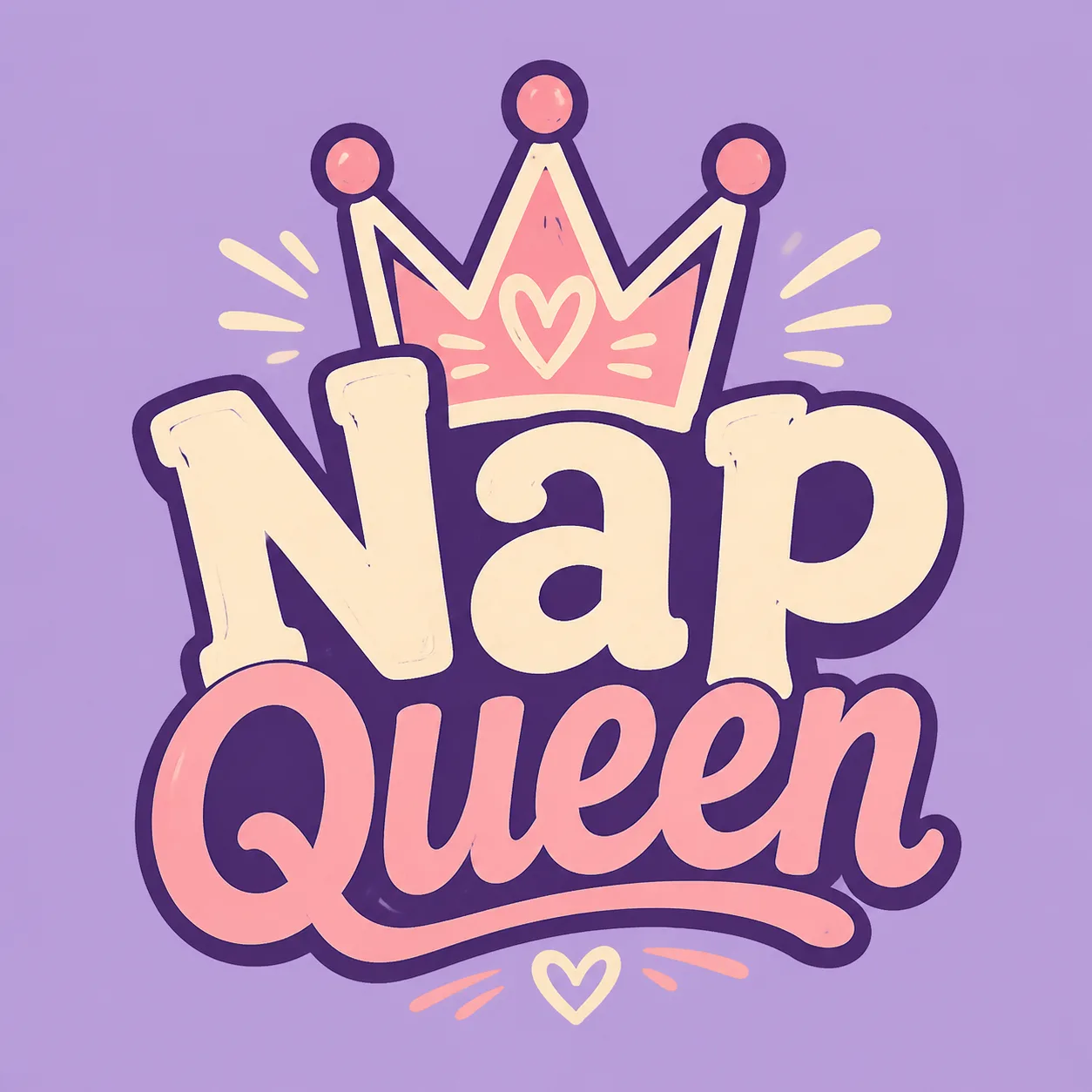
Build one bold, centered t-shirt graphic around the Slogan and the Main Graphic Subject. Render the Slogan exactly as written, with every word correctly spelled, using chunky, playful lettering that reads clearly from a distance. Integrate the Main Graphic Subject directly into the typography so the crown feels like part of the statement rather than a separate floating element. Use the Ink Colors as a limited screen-print palette with clean edges, strong contrast, deliberate negative space, and a slightly hand-drawn character. Present only the flat artwork on a plain solid background matching the Shirt Color, with no shirt visible. Keep the composition compact and balanced for a front-chest print. Show a print-realistic finish suitable for screen printing or DTG, with no watermarks, brand tags, price labels, borders, logos, or extra text.

Use these details:
Slogan: "Nap Queen"
Main Graphic Subject: "Hand-drawn crown doodle"
Ink Colors: ["Deep purple", "Cream", "Soft pink"]
Shirt Color: "Lavender"
Using your own logo, product or face? Attach it in the chat and say which of the details it replaces.
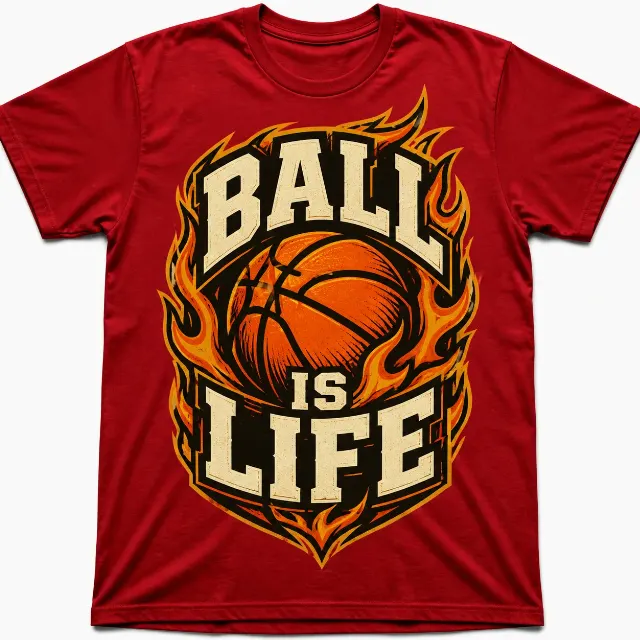
Your result will come out close to the example rather than identical to it. Change the details to make it yours.