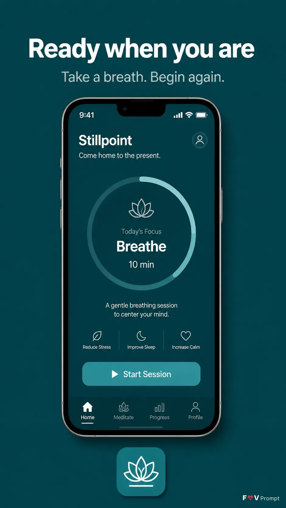
Present a professionally designed App Store closing screenshot for the meditation app App Name in a vertical 9:16 composition. Use a solid Brand Color background with comfortable margins and no busy decoration. Place the Headline at the top in large, bold, clean sans serif type, rendered exactly as written and kept to one or two lines. Add the Subline beneath it in smaller, highly legible type. Center one generic modern smartphone with thin bezels, no brand logo and the Device Angle, casting a soft realistic shadow. Use App Screenshots as the phone screen content, preserving it exactly; if it is empty, design the Screen Content as a believable meditation interface with a visible 9:41 status bar, crisp components and correctly spelled text. Use the same Brand Color throughout the UI. Place the App Icon neatly above or below the phone. Keep the screen sharp and readable, with no star ratings, reviews, store badges, watermarks, glow, lens flares, sparkles or gibberish text.

Use these details:
App Name: "Stillpoint"
Headline: "Ready when you are"
Subline: "Take a breath. Begin again."
Brand Color: "deep teal"
Screen Content: "A meditation app home screen showing a 10-minute breathing session, a calm progress ring and a simple Start Session button"
Device Angle: "straight-on, front-facing"
App Screenshots: "No source screen provided"
App Icon: "A rounded teal icon with a simple white lotus mark"
Using your own logo, product or face? Attach it in the chat and say which of the details it replaces.
Your result will come out close to the example rather than identical to it. Change the details to make it yours.