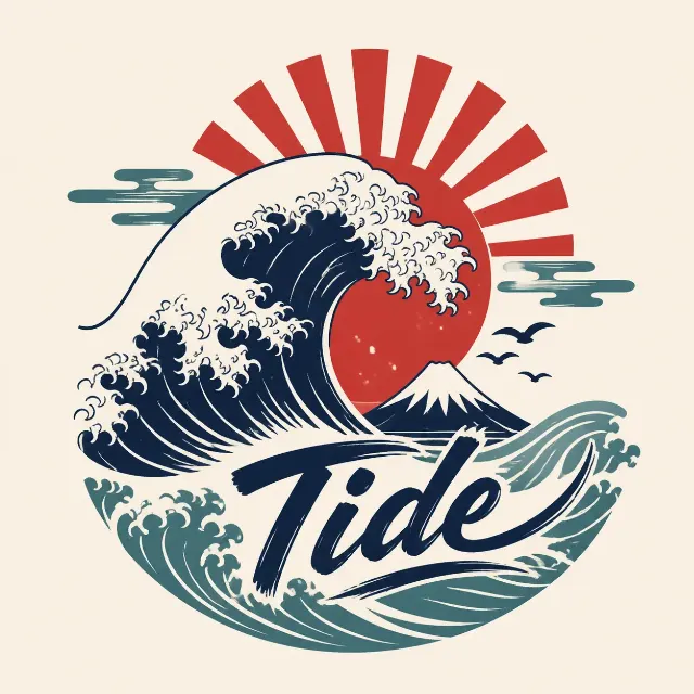
Build one centered, print-ready t-shirt graphic around the Graphic Subject, with the Slogan integrated into the illustration in a small, refined serif typeface. Keep the composition minimal and readable from a distance: use a confident single-line drawing, generous negative space, balanced vertical spacing, and clear hierarchy between the graphic and lettering. Render the design with the Ink Colors on a plain background matching the Shirt Color. Keep the lines crisp and clean for screen printing or DTG, with no gradients, shading, textures, or unnecessary decoration. The flat presentation must show only the artwork on the solid shirt-color background, with no shirt visible. Spell every word in the Slogan correctly. Do not add extra text, borders, watermarks, brand tags, price labels, logos, or copyrighted imagery.

Use these details:
Slogan: "But First, Coffee"
Graphic Subject: "A minimal single-line coffee cup with a small curl of steam"
Ink Colors: ["Black"]
Shirt Color: "White"
Using your own logo, product or face? Attach it in the chat and say which of the details it replaces.
Your result will come out close to the example rather than identical to it. Change the details to make it yours.