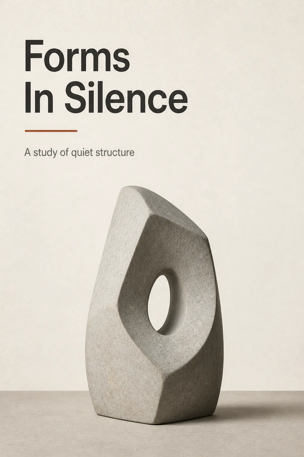
Present a flat art exhibition poster, shown straight on and filling the frame in the Format. Build the composition around one carefully lit photograph of the Main Visual Subject, placed slightly below center with generous negative space. Use a strict Swiss layout with an asymmetric grid, precise alignment, strong margins and a clear visual hierarchy. Set the Main Title large and deliberate near the upper left, with the Subtitle directly beneath it in a smaller clean sans-serif. Use the Color Palette with restraint, allowing the sculpture photograph and one accent detail to carry the visual focus. Keep the typography crisp, correctly spelled and limited to the supplied text. Make the design feel like a considered print studio piece with subtle paper texture, but no decorative clutter, outer border, watermark, logo or QR code. Use the Format exactly as specified.

Use these details:
Main Title: "Forms In Silence"
Subtitle: "A study of quiet structure"
Main Visual Subject: "A solitary abstract stone sculpture with smooth planes and a small central opening"
Color Palette: "warm white, charcoal, muted stone gray and one restrained rust accent"
Format: "2:3 portrait"
Using your own logo, product or face? Attach it in the chat and say which of the details it replaces.
Your result will come out close to the example rather than identical to it. Change the details to make it yours.