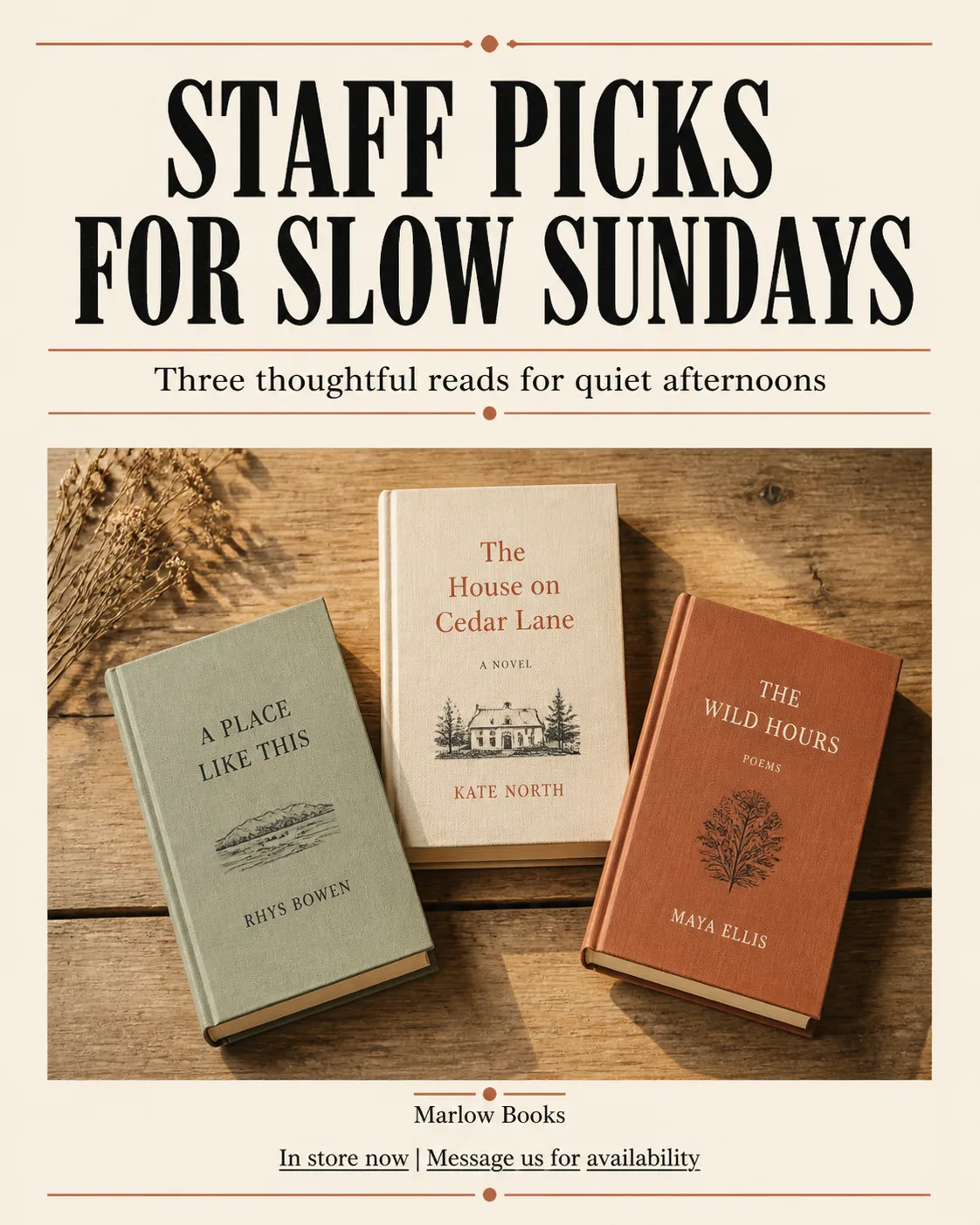
Build a 4:5 portrait Instagram post for a small independent bookstore. Photograph the Photo Subject as a carefully arranged flat lay on a lightly worn wooden table, viewed directly from above. Use soft natural window light, gentle shadows and realistic paper and wood texture. Compose the books with enough quiet space around them for typography, keeping the image warm, tactile and editorial rather than glossy.

Treat the layout like a well-designed newspaper front page: place the Headline prominently near the top in a bold condensed serif or newspaper display typeface, with a clear hierarchy and precise alignment. Set the Supporting Text in a smaller readable style beneath it. Use the Color Palette across the type, rules and restrained accents, with generous cream-colored negative space. Show the Business Name small and only once in the footer. Set the Contact Details as a simple underlined text call to action, never as a button. Render every word exactly as written, with correct spelling, clean edges and nothing touching the image borders. Avoid decorative circles, grids, badges, gradients, glow and extra copy.

Use these details:
Business Name: "Marlow Books"
Headline: "STAFF PICKS FOR SLOW SUNDAYS"
Supporting Text: "Three thoughtful reads for quiet afternoons"
Photo Subject: "three hardcover books with varied muted covers and visible page edges"
Color Palette: "warm cream, ink black and terracotta"
Contact Details: "In store now | Message us for availability"
Using your own logo, product or face? Attach it in the chat and say which of the details it replaces.
Your result will come out close to the example rather than identical to it. Change the details to make it yours.