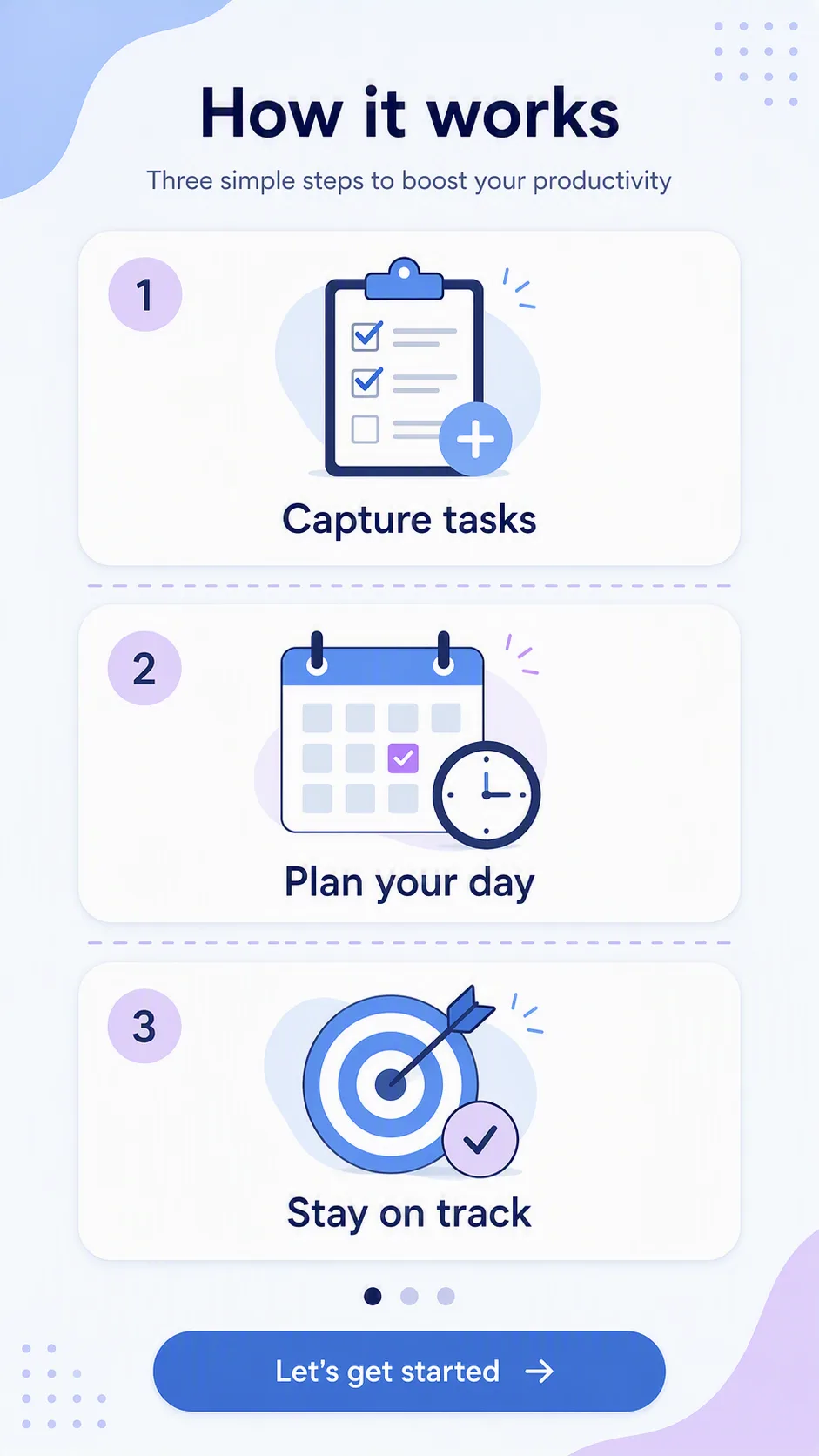
Design a clean mobile app onboarding screen showing three how-it-works steps for a productivity app. Arrange three evenly spaced sections in a vertical 9:16 composition, with one simple, friendly flat icon above each step and the corresponding Onboarding Steps label rendered exactly as written beneath it. Use the Color Palette across the background, icons, dividers and typography, keeping strong contrast and generous white space. Give the screen a clear visual hierarchy, rounded geometric shapes, consistent line weight and restrained interface styling that feels easy to understand at a glance. Include subtle card or panel separation without making the layout busy. Keep every icon distinct and directly related to its adjacent label. Use crisp, legible sans-serif typography, accurate spelling and clean alignment throughout. Present the result as a finished app screenshot in the Format.

Use these details:
Onboarding Steps: ["Capture tasks", "Plan your day", "Stay on track"]
Color Palette: "pastel blue, white, soft lavender and muted navy"
Format: "9:16 vertical"
Using your own logo, product or face? Attach it in the chat and say which of the details it replaces.
Your result will come out close to the example rather than identical to it. Change the details to make it yours.