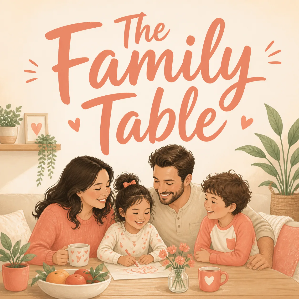
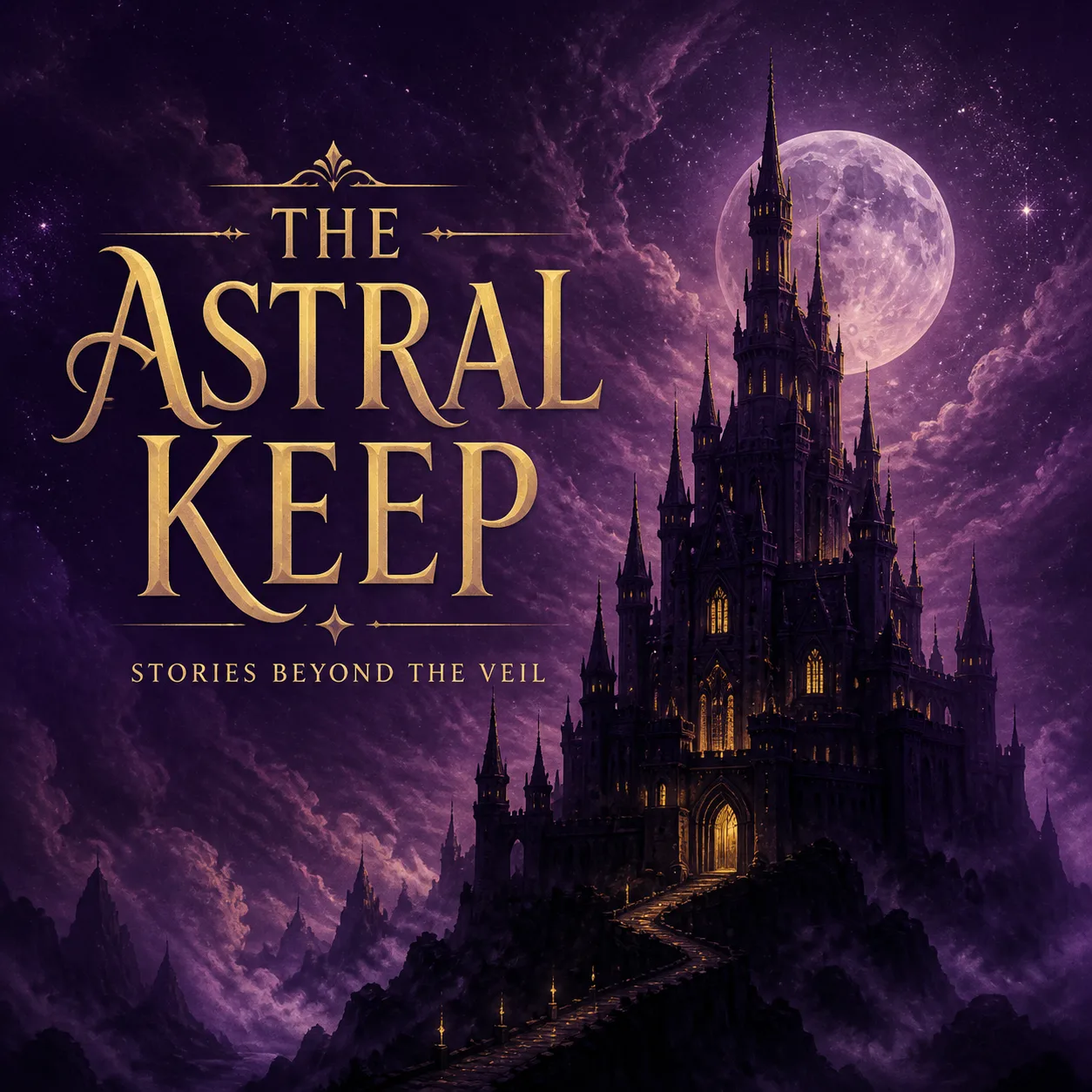
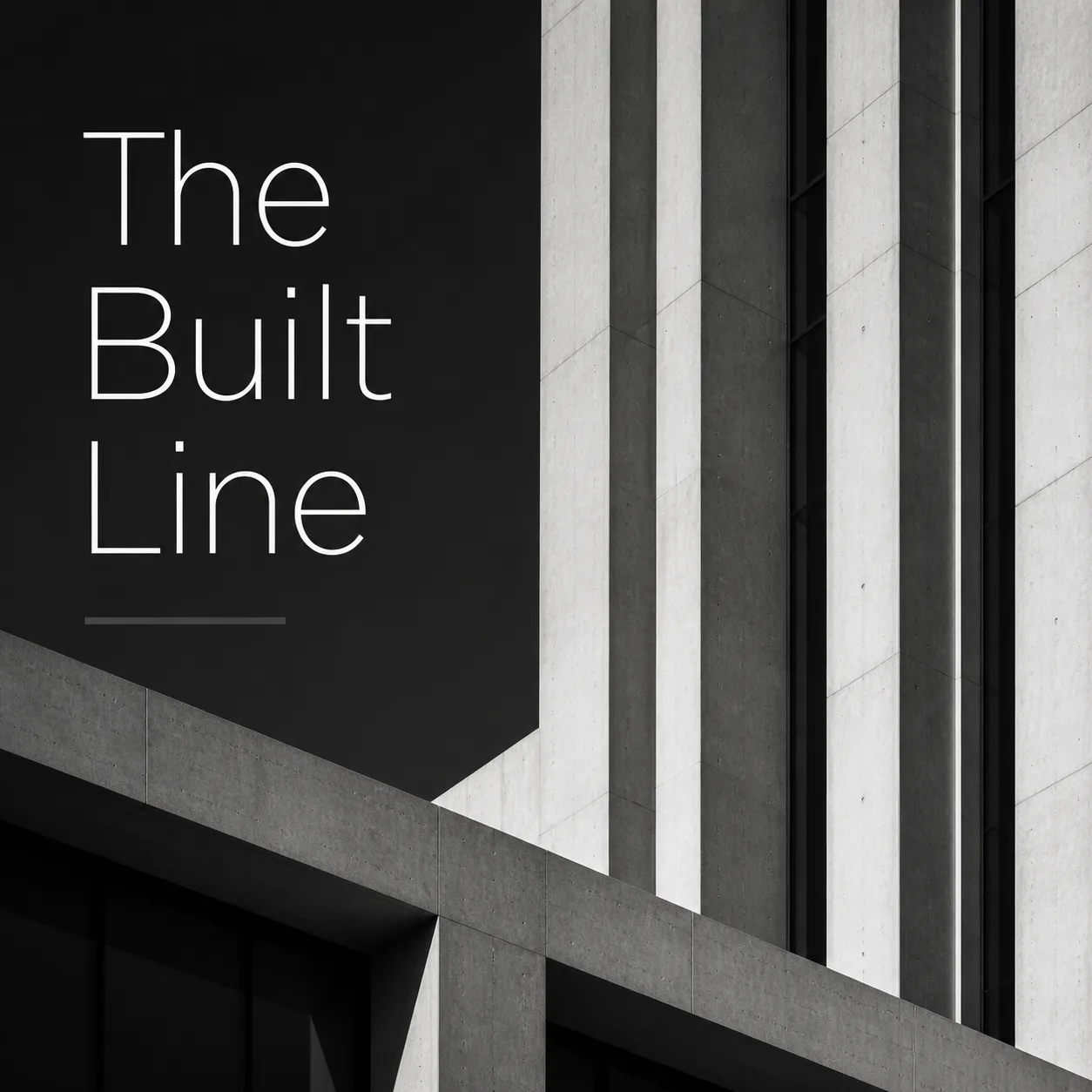
Build one square podcast cover around the Central Visual, rendered as a soft pastel illustration with a warm, welcoming parenting mood. Use a full-bleed pale background and apply the Accent Color to selected clothing details, small decorative marks, and subtle emphasis areas so the palette feels cohesive rather than busy. Place the Show Name as the dominant element, using a bold warm handwritten display typeface with generous spacing and strong contrast against its background. Keep the lettering short, clearly aligned, correctly spelled, and readable when the artwork is reduced to a small podcast-app tile. Arrange the family illustration as one clear central idea, with clean shapes, gentle expressions, and enough open space around the title. Use no more than two typefaces, keep all text safely inside the canvas, and avoid episode numbers, play buttons, microphone clipart, watermarks, logos, borders, and inner frames. Output a 1:1 square composition with no text or artwork running off the edges.

Use these details:
Show Name: "The Family Table"
Central Visual: "a softly illustrated family gathered together at home"
Accent Color: "coral peach"
Using your own logo, product or face? Attach it in the chat and say which of the details it replaces.
Your result will come out close to the example rather than identical to it. Change the details to make it yours.