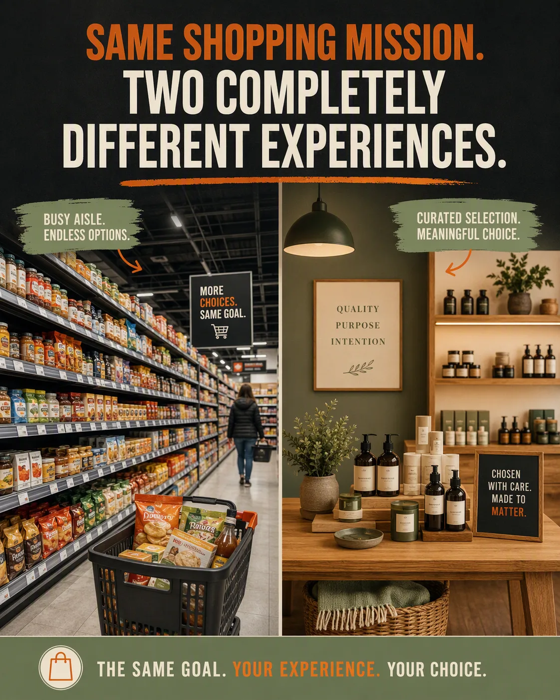
A vertical split-frame marketplace Instagram post contrasting the Retail Shelf Scene on the left with the Boutique Display Scene on the right. Keep the two halves clearly distinct but balanced, with a sharp central divide and comparable visual scale. Place the Headline prominently across the upper third in bold, highly legible sans-serif typography, rendering it exactly as written. Use the Color Palette consistently across the shelving, fixtures, background accents and type, with strong contrast between the headline and its surroundings. Make the composition feel editorial and commercially persuasive, combining documentary retail detail on the left with intentional boutique styling on the right. Use crisp product photography, controlled perspective, clean spacing and subtle depth. Avoid warped products, cluttered type, unreadable lettering and accidental logos. Format the finished composition as the Format.

Use these details:
Retail Shelf Scene: "A busy supermarket aisle with neatly stocked shelves, shopping baskets and visible product variety"
Boutique Display Scene: "A carefully arranged independent boutique with curated products, warm fixtures and spacious presentation"
Headline: "SAME SHOPPING MISSION. TWO COMPLETELY DIFFERENT EXPERIENCES."
Color Palette: "deep charcoal, warm cream, saturated orange and muted sage green"
Format: "4:5 Instagram post"