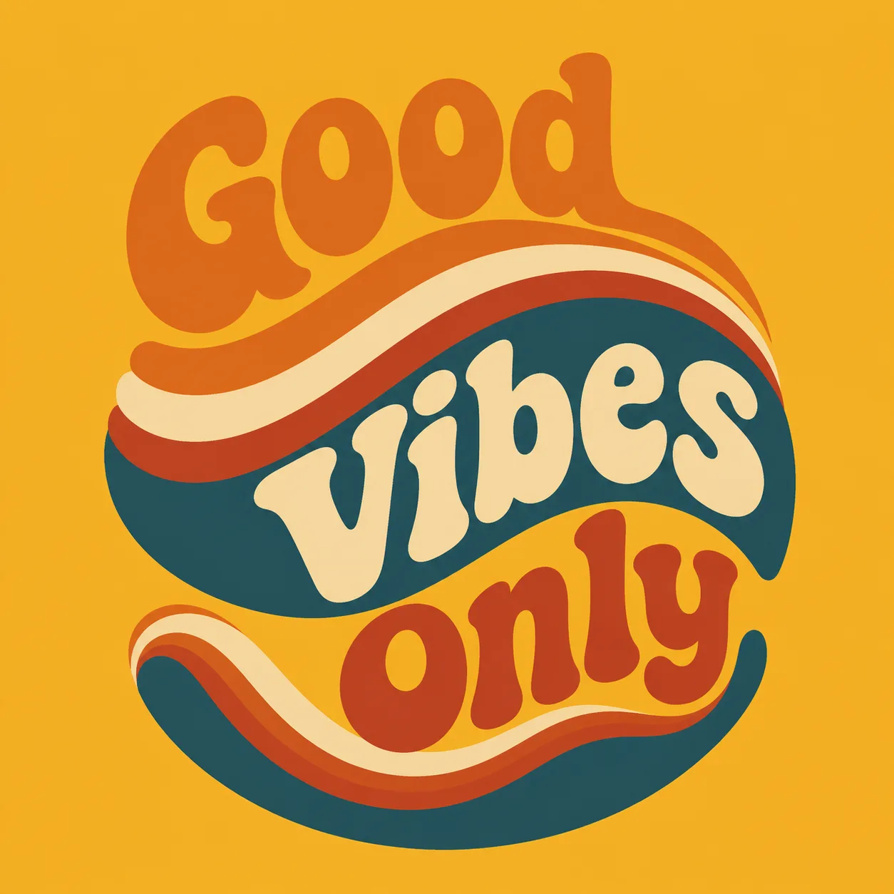
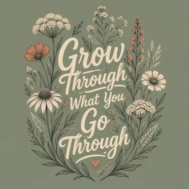
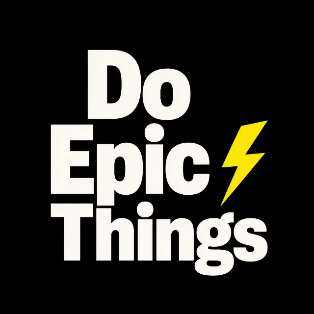
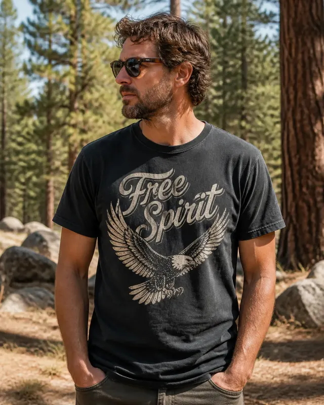
Build one centered, print-ready 1970s t-shirt graphic around the Slogan and the Main Graphic Subject. Use chunky, rounded, groovy lettering with a slightly arched layout, integrating the words into the flowing wave shapes rather than placing text and image separately. Render the Slogan exactly as written, with correct spelling and no extra words. Use the Ink Colors as a limited screen-print palette, keeping the shapes crisp, flat, and easy to read from a distance. Set the entire design against a plain solid background matching the Shirt Color, with no shirt visible. Balance the composition with bold silhouette, clear hierarchy, and deliberate negative space. Give the artwork a clean vintage poster feel without distressing, gradients, borders, watermarks, brand tags, or price labels.

Use these details:
Slogan: "Good Vibes Only"
Main Graphic Subject: "layered rainbow waves"
Ink Colors: ["burnt orange", "cream", "rust red", "deep teal"]
Shirt Color: "mustard yellow"
Using your own logo, product or face? Attach it in the chat and say which of the details it replaces.
Your result will come out close to the example rather than identical to it. Change the details to make it yours.