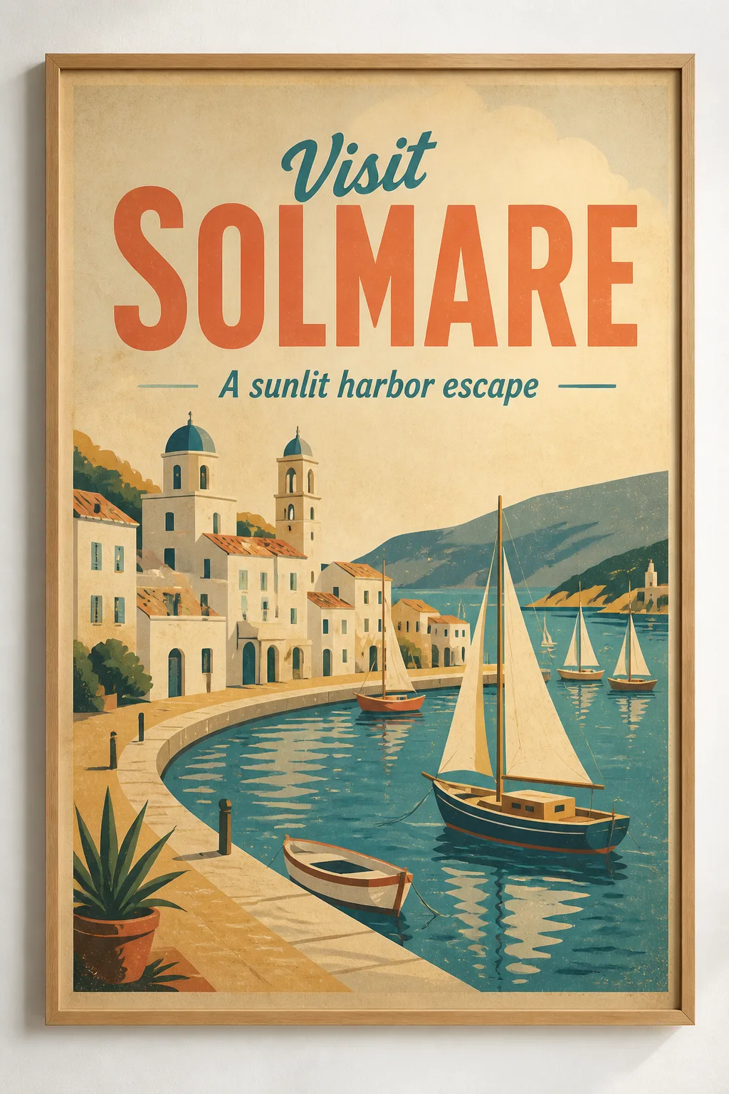
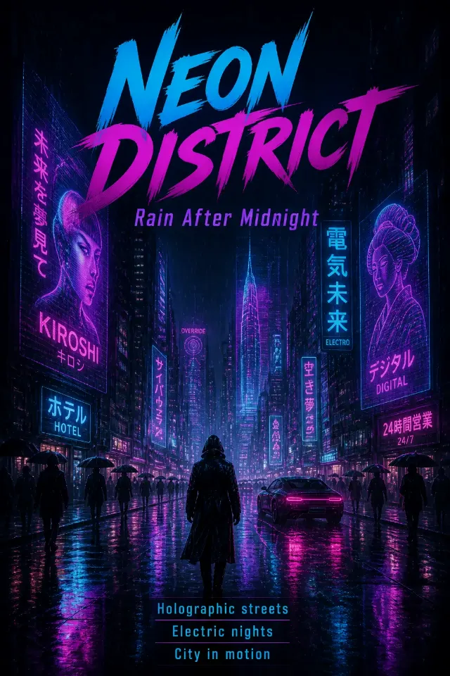
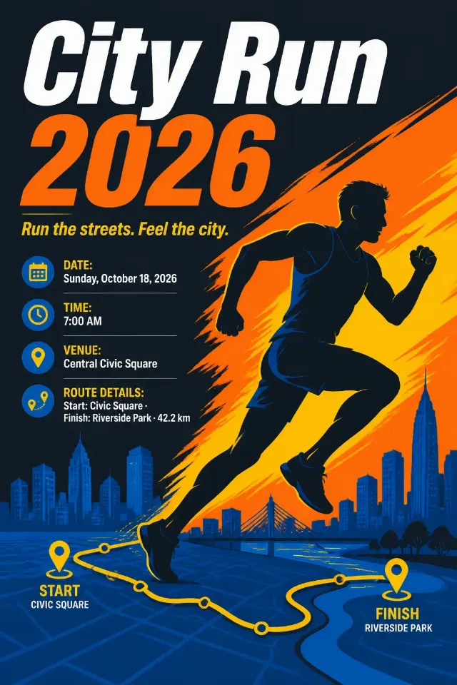
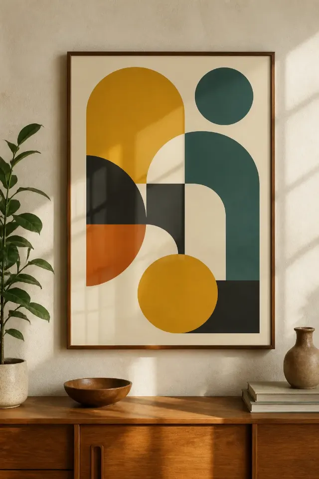
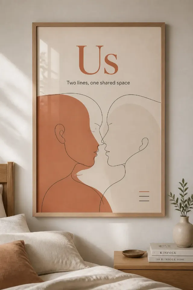
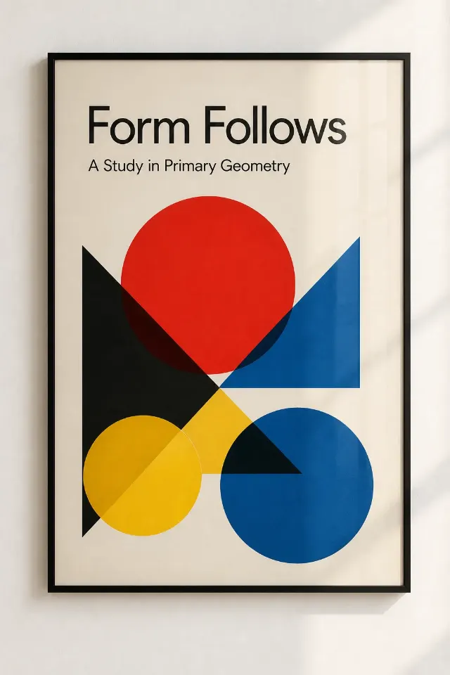
Design a vintage travel poster featuring the Main Visual Subject, with the Main Title as the dominant text and the Subtitle beneath it in a smaller complementary style. Use a bold, period-inspired display typeface, clean hand-printed shapes, simplified architectural forms, and a strong visual hierarchy with generous margins. Apply the Color Palette in sun-faded blocks with subtle aged-paper texture and restrained print wear, evoking a classic seaside tourism poster without copying any real place or existing artwork. Keep the wording exactly as provided, correctly spelled, and limited to the title and one short subtitle. Show the finished poster as a realistic Mockup Setting, photographed straight on with believable wall light, visible paper texture, and the poster remaining the clear focus. Use the Format, with no outer image border, watermarks, logos, QR codes, or extra text.

Use these details:
Main Title: "Visit Solmare"
Subtitle: "A sunlit harbor escape"
Main Visual Subject: "an original coastal town with whitewashed buildings, a curved harbor, and several sailboats"
Color Palette: "sun-faded coral, muted teal, warm cream, ochre, and weathered navy"
Mockup Setting: "a thin natural wood frame on a white wall"
Format: "2:3 portrait"
Using your own logo, product or face? Attach it in the chat and say which of the details it replaces.
Your result will come out close to the example rather than identical to it. Change the details to make it yours.