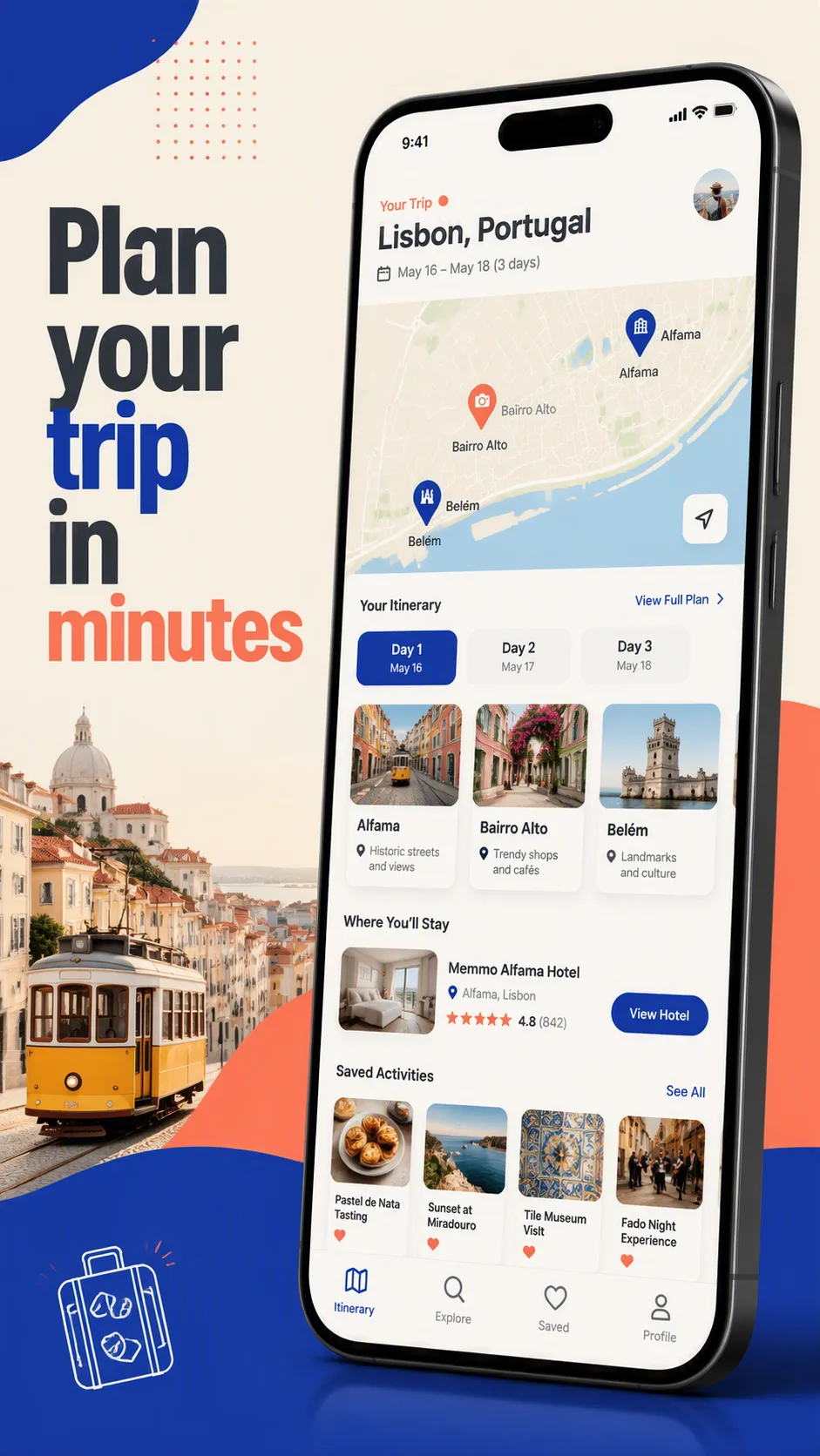
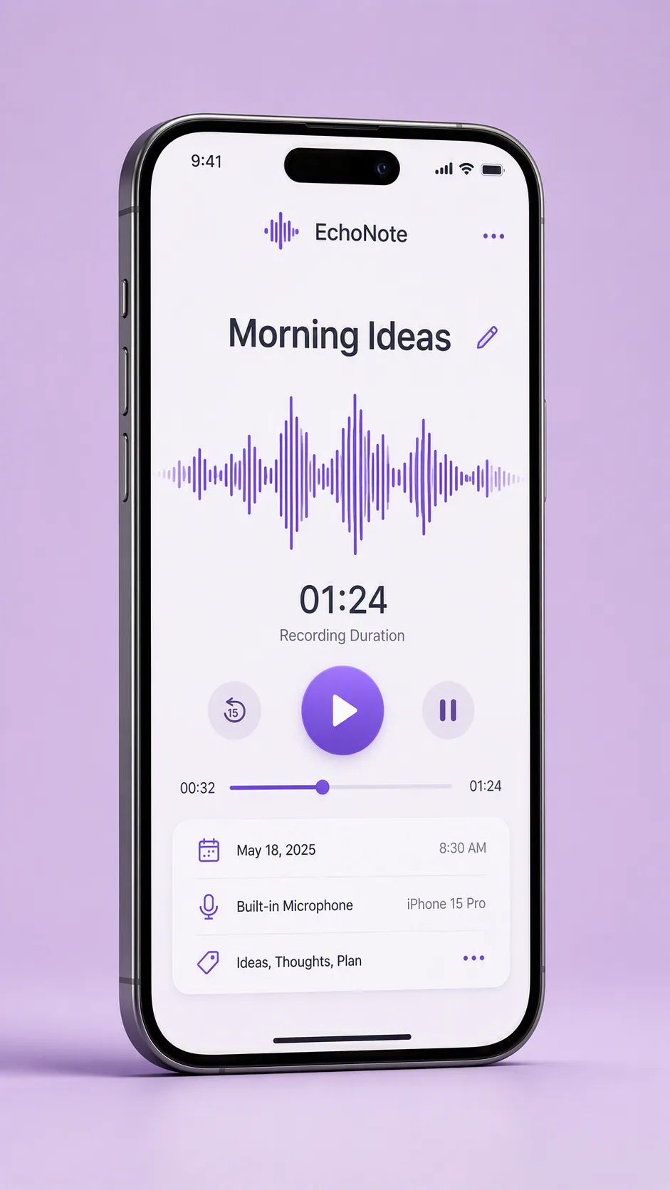
A clean travel app feature showcase centered on a modern smartphone mockup, displayed vertically in the Format. Show the App Name at the top of the interface with a detailed map filling most of the screen. Connect the Route Pins with a clear curved route line, using distinct markers and small location labels that remain legible at phone scale. Include subtle map details such as roads, coastlines and terrain without making the interface feel crowded. Use the Color Palette consistently across the route line, pins, navigation controls and supporting interface accents. Place the phone against a simple softly lit background with a slight shadow and enough breathing room around the device. Keep the screen straight-on and highly readable, with crisp UI edges, balanced spacing and a polished travel-product presentation. Render all interface text cleanly without garbled letters or overlapping labels.

Use these details:
App Name: "Roamly"
Route Pins: ["Lisbon", "Porto", "Madrid", "Barcelona"]
Color Palette: "deep teal, coral, warm cream and charcoal"
Format: "9:16 vertical"
AI models never repeat themselves exactly, so your result will differ from the one here. Change the details to make it yours.