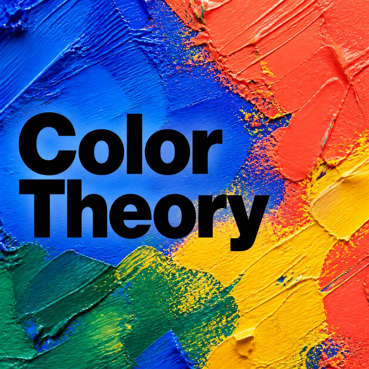
Build a square 1:1 podcast cover around the Central Symbol, showing a close-up of richly layered paint texture with tactile brush ridges, palette-knife marks and energetic color variation. Use the Accent Color across the full-bleed background so the artwork feels vibrant and immediate, with no inner border or frame. Place the Show Name prominently over the texture in a heavy black sans-serif typeface, using short, bold lettering that remains unmistakably readable when reduced to a small podcast-app tile. Keep the title clear of the busiest texture areas, with strong contrast, generous margins and deliberate alignment. Use no more than two typefaces. Keep the composition focused on the paint surface and typography, with no extra objects, episode numbers, play buttons, watermarks, brand logos or microphone clipart. Ensure every letter is spelled correctly and no text touches or runs off the canvas.

Use these details:
Show Name: "Color Theory"
Central Symbol: "a close-up field of thickly layered abstract paint with visible brush ridges and palette-knife marks"
Accent Color: "electric cobalt blue, vivid coral, lemon yellow and emerald green"
Using your own logo, product or face? Attach it in the chat and say which of the details it replaces.
Your result will come out close to the example rather than identical to it. Change the details to make it yours.