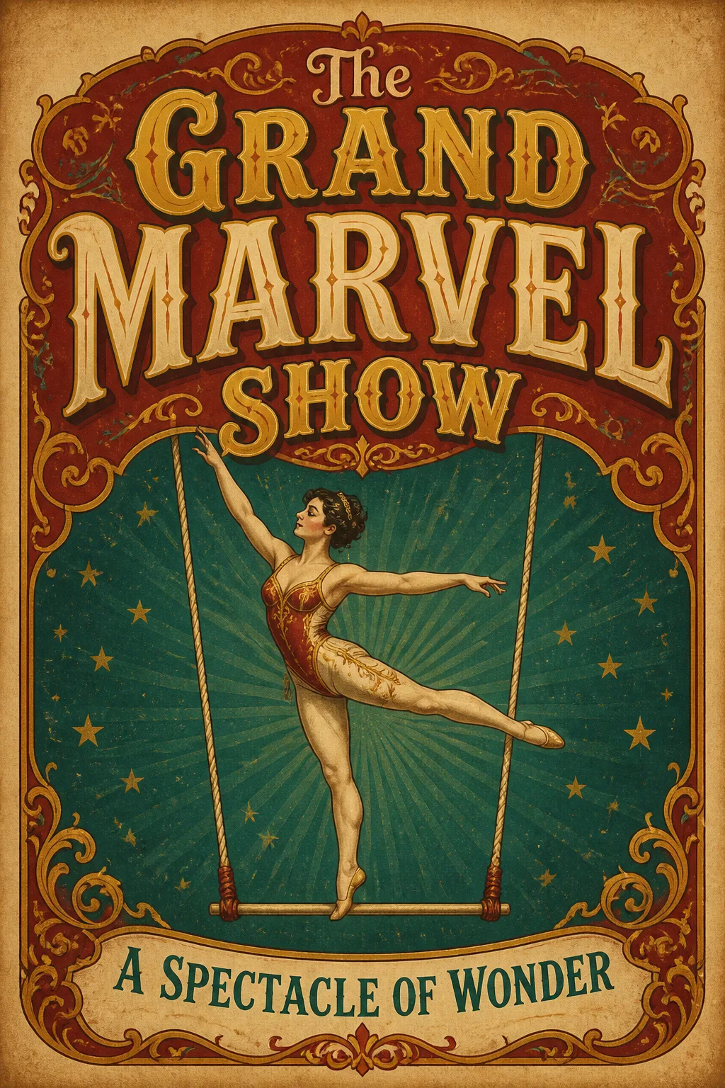
Design one flat, portrait-oriented vintage circus poster in a 2:3 composition, shown straight on and filling the frame. Use the Main Title as the dominant text in ornate, theatrical circus lettering, with the Subtitle beneath it at a smaller scale. Illustrate the Main Visual Subject as the single central visual focus, using graceful hand-drawn linework, decorative flourishes and a balanced symmetrical layout. Apply the Color Palette with strong contrast between the lettering, illustration and background. Use the Paper Texture across the poster for an authentic aged print surface. Establish a clear hierarchy with generous margins: title first, acrobat second, subtitle third. Keep every word correctly spelled and render the Main Title and Subtitle exactly as written. Do not add extra text, logos, watermarks, QR codes or an outer image border.

Use these details:
Main Title: "The Grand Marvel Show"
Subtitle: "A Spectacle of Wonder"
Main Visual Subject: "A graceful acrobat balancing on a suspended trapeze"
Color Palette: "faded crimson, muted gold, deep teal and cream"
Paper Texture: "warm aged paper with subtle foxing and worn print fibers"
Using your own logo, product or face? Attach it in the chat and say which of the details it replaces.
Your result will come out close to the example rather than identical to it. Change the details to make it yours.