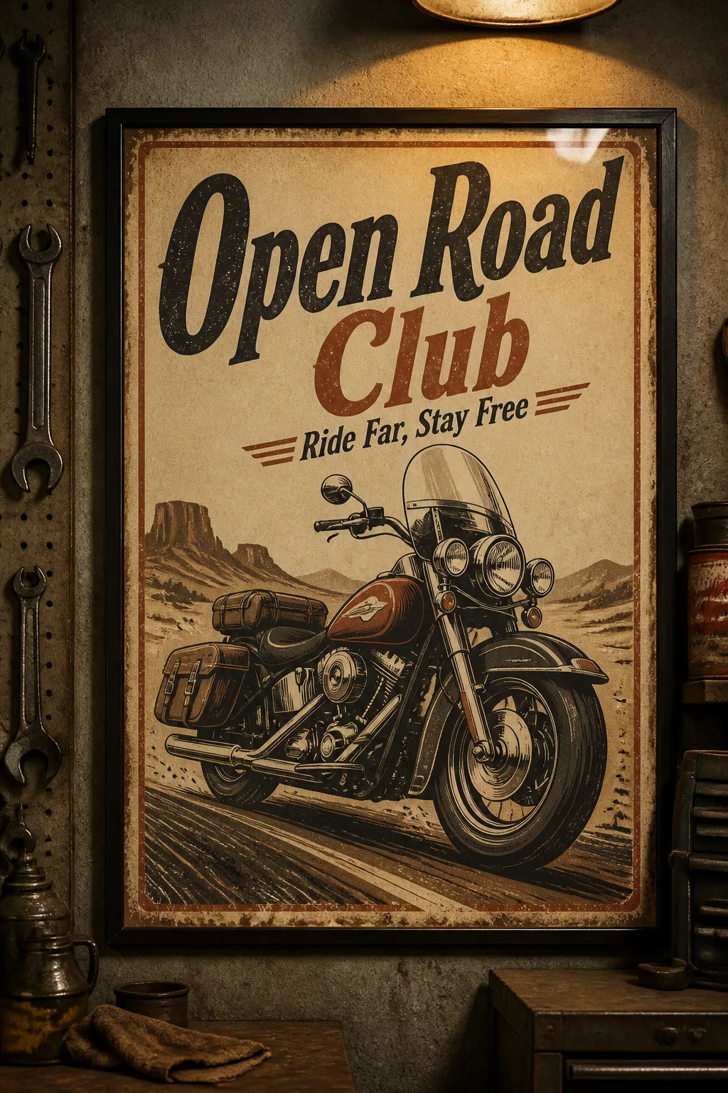
Design a portrait 2:3 vintage motorcycle poster using the Main Title as the dominant headline and the Subtitle beneath it in a smaller, period-appropriate display typeface. Build the central composition around the Main Visual Subject, rendered as a bold hand-drawn motorcycle illustration with simplified mechanical details, strong silhouette and a sense of forward motion. Apply the Color Palette with clear tonal hierarchy and generous negative space. Use the Print Treatment throughout the artwork so it feels like an aged print pulled from a small motorcycle club workshop, with authentic ink wear and paper texture rather than a digital filter. Keep the typography crisp, correctly spelled and limited to the supplied title and subtitle. Show the finished poster as a realistic framed mockup in the Display Setting, straight on with believable glass reflections, natural paper texture and warm garage lighting. The poster remains the clear focus, with no logos, watermarks, QR codes or outer image border.

Use these details:
Main Title: "Open Road Club"
Subtitle: "Ride Far, Stay Free"
Main Visual Subject: "Classic touring motorcycle viewed in three-quarter profile"
Color Palette: "Faded cream, tobacco brown, muted rust and deep charcoal"
Display Setting: "A weathered mechanic's garage with concrete walls, pegboard tools and warm overhead light"
Print Treatment: "Distressed screen-printed ink with worn edges, subtle scratches and uneven coverage"
Using your own logo, product or face? Attach it in the chat and say which of the details it replaces.
Your result will come out close to the example rather than identical to it. Change the details to make it yours.