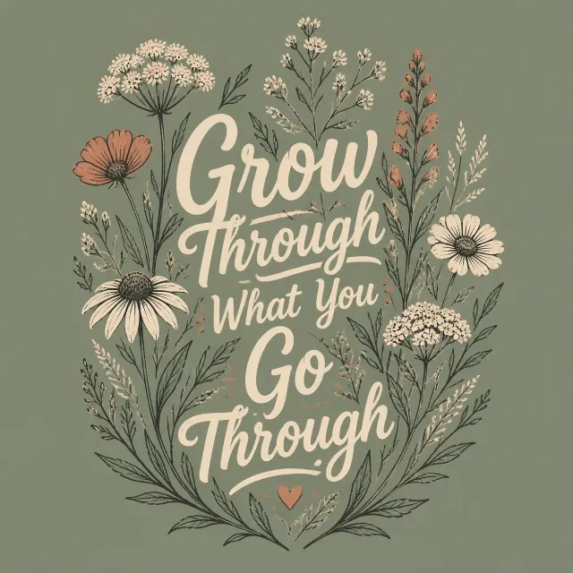
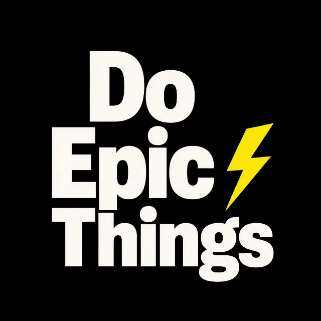
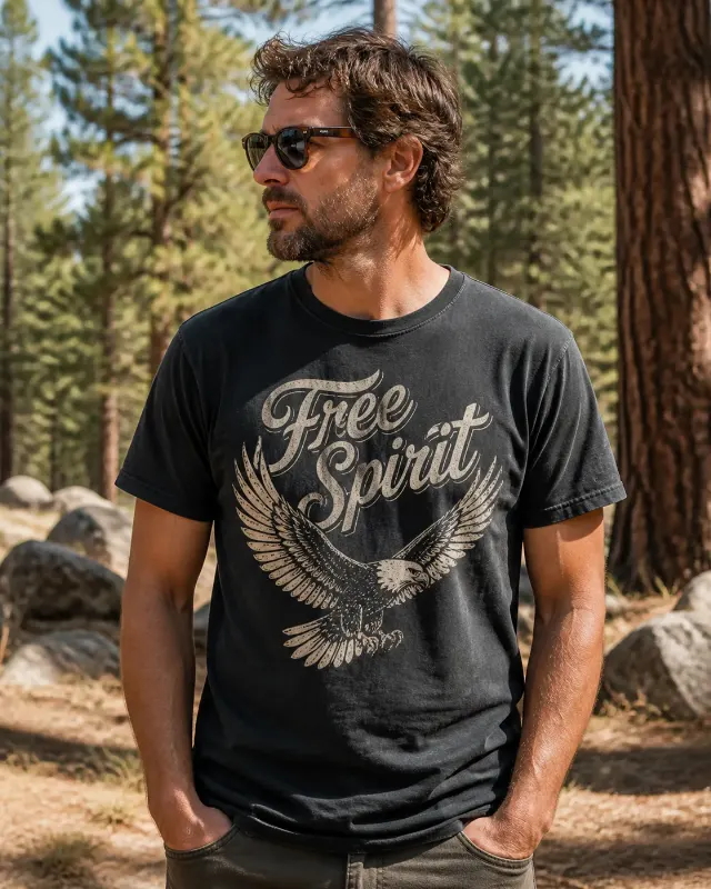
Build one centered t-shirt graphic around the Main Graphic Subject, with the Slogan as the dominant lettering and the Secondary Line as an optional smaller line beneath it. Integrate the text and illustration into a single bold composition with a clear silhouette, strong visual hierarchy and deliberate negative space that reads from a distance. Use the Ink Colors as a limited four-ink palette and apply the Print Finish for an authentic sun-faded, lightly distressed screen-print look with clean, production-ready edges. Place the finished design on a real cotton tee in the Shirt Color, presented according to the Mockup Presentation. Show realistic fabric texture, natural folds and ink that follows the fabric rather than floating above it. Keep the print fully visible and centered. Check every word for correct spelling. No watermarks, brand tags, price labels, borders, logos or extra text.

Use these details:
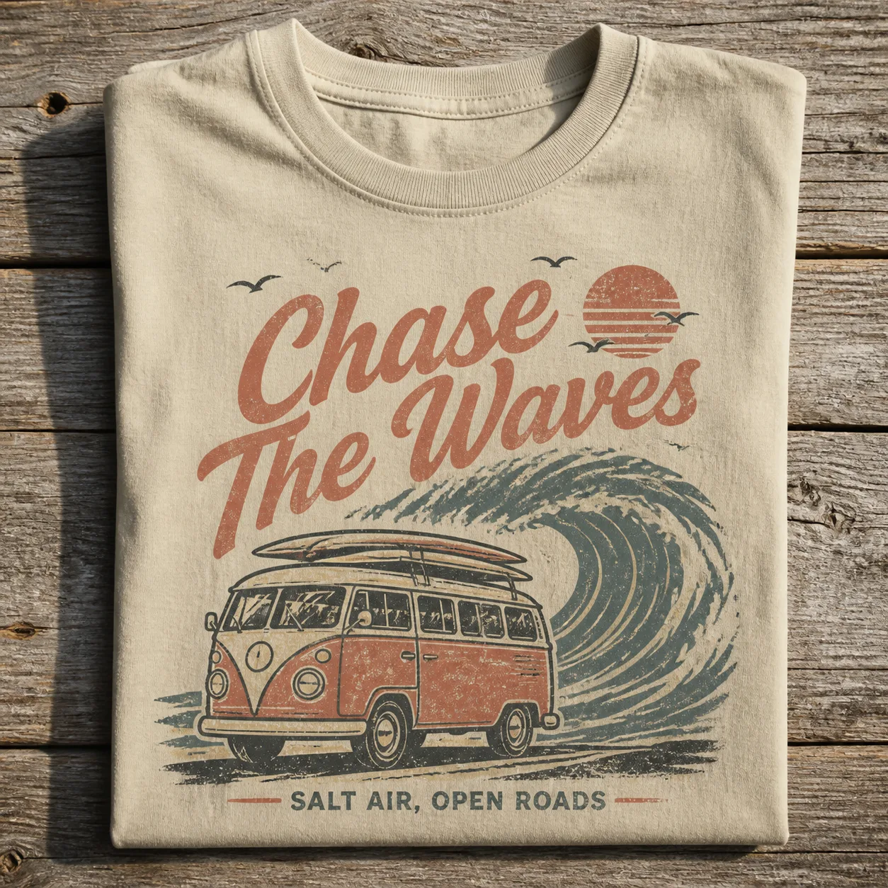
Slogan: "Chase The Waves"
Secondary Line: "Salt Air, Open Roads"
Main Graphic Subject: "Vintage surf van illustration with a roof rack, curling ocean wave and small sun"
Ink Colors: "Faded terracotta, muted teal, warm cream and charcoal"
Shirt Color: "Sand"
Print Finish: "Sun-faded vintage screen print with lightly distressed ink"
Mockup Presentation: "Folded flat on a weathered wooden table in soft natural light"
Using your own logo, product or face? Attach it in the chat and say which of the details it replaces.
Your result will come out close to the example rather than identical to it. Change the details to make it yours.